Introduction
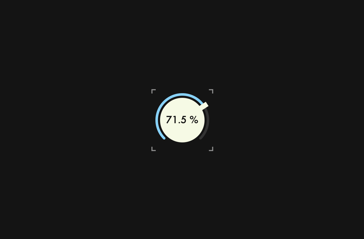
In this tutorial, I will explain how to create Modern Dial. This dial was designed by suzuki kentaro, and I made this with JUCE. Before we start the tutorial, we need to do a little preparation.
Prerequisites
Select "GUI" template and create a new project named DialTutorial.
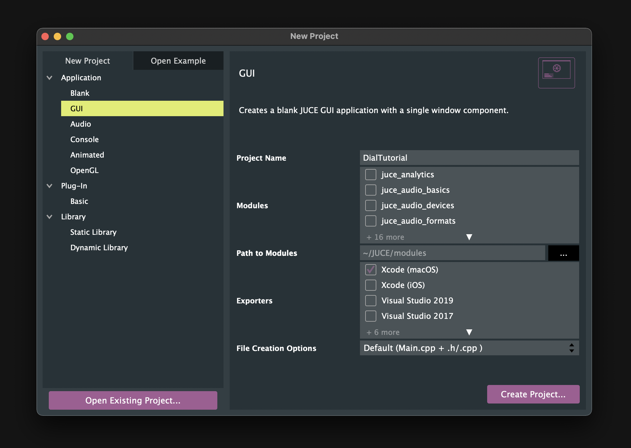
Then, select "Add New CPP & Header File" or "Add New Header File" as shown below to create all the files needed for this tutorial in advance.
Files to create:
- CustomColours.h
- CustomLookAndFeel.h/.cpp
- Dial.h/.cpp
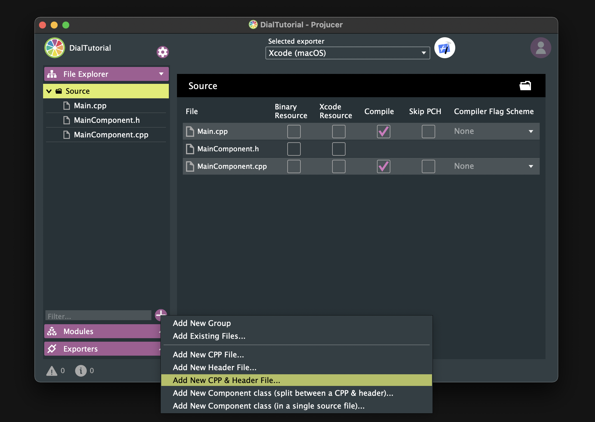
Make sure all the files have been created and open your IDE.
Next, define the following custom colours in CustomColours.h:
#pragma once
#include <JuceHeader.h>

namespace CustomColours
{
    const juce::Colour blue       = juce::Colour::fromFloatRGBA (0.43f, 0.83f, 1.0f,  1.0f);
    const juce::Colour green      = juce::Colour::fromFloatRGBA (0.34f, 0.74f, 0.66f, 1.0f);
    const juce::Colour yellow     = juce::Colour::fromFloatRGBA (1.0f,  0.71f, 0.2f,  1.0f);
    const juce::Colour creamWhite = juce::Colour::fromFloatRGBA (0.96f, 0.98f, 0.89f, 1.0f);
    const juce::Colour grey       = juce::Colour::fromFloatRGBA (0.55f, 0.55f, 0.55f, 1.0f);
    const juce::Colour blackGrey  = juce::Colour::fromFloatRGBA (0.2f,  0.2f,  0.2f,  1.0f);
    const juce::Colour black      = juce::Colour::fromFloatRGBA (0.08f, 0.08f, 0.08f, 1.0f);
}
Finally, make sure it builds successfully.
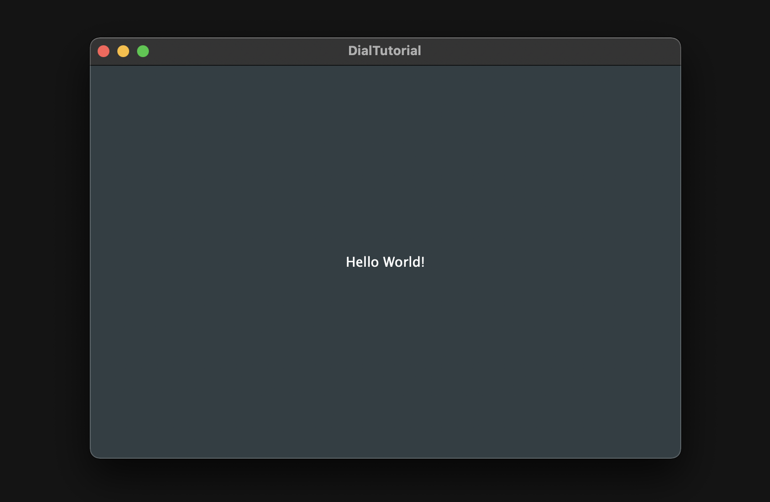
That's all the preparation we need to do to start the tutorial. Let's get started!
Basic Dial
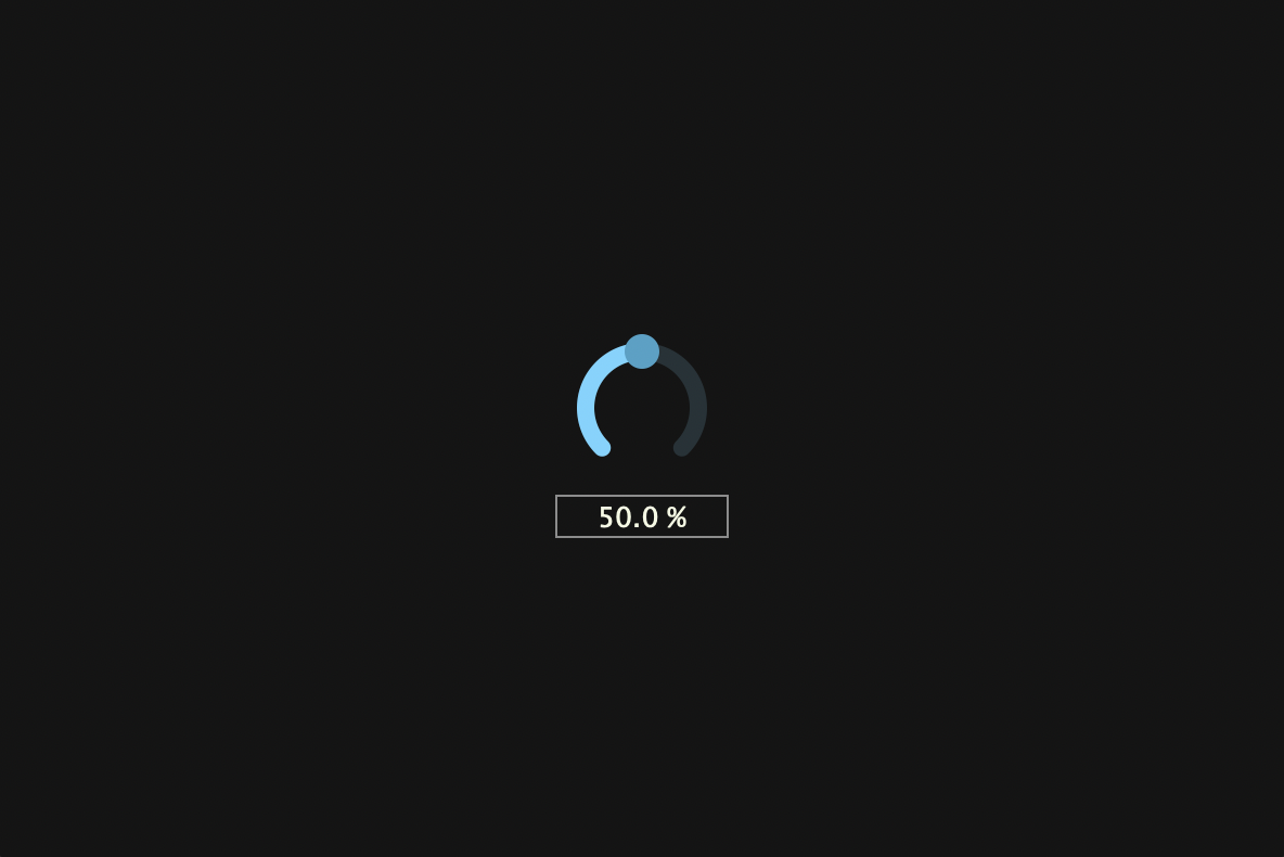
In this chapter, we will create a basic dial as shown below.
Customizing slider
First, I will show you the whole implementation of Dial class, and then I will pick up some particularly important member functions and explain them.
Dial.h:
#pragma once

#include <JuceHeader.h>
#include "CustomColours.h"

class Dial  : public juce::Slider
{
public:
    Dial();
    ~Dial();
};
Dial.cpp:
Dial::Dial()
{
    setSliderStyle (juce::Slider::SliderStyle::RotaryVerticalDrag);
    setTextBoxStyle (juce::Slider::TextBoxBelow, false, 80, 20);
    setRotaryParameters (juce::MathConstants<float>::pi * 1.25f,
                         juce::MathConstants<float>::pi * 2.75f,
                         true);
    setColour (juce::Slider::textBoxTextColourId,    CustomColours::creamWhite);
    setColour (juce::Slider::textBoxOutlineColourId, CustomColours::grey);
    setColour (juce::Slider::rotarySliderFillColourId, CustomColours::blue);
    setVelocityBasedMode (true);
    setVelocityModeParameters (1.0, 1, 0.1, false);
    setRange (0.0, 100.0, 0.01);
    setValue (50.0);
    setDoubleClickReturnValue (true, 50.0);
    setTextValueSuffix (" %");
    onValueChange = [&]()
    {
        if (getValue() < 10)
            setNumDecimalPlacesToDisplay (2);
        else if (10 <= getValue() && getValue() < 100)
            setNumDecimalPlacesToDisplay (1);
        else
            setNumDecimalPlacesToDisplay (0);
    };
}

Dial::~Dial()
{
}
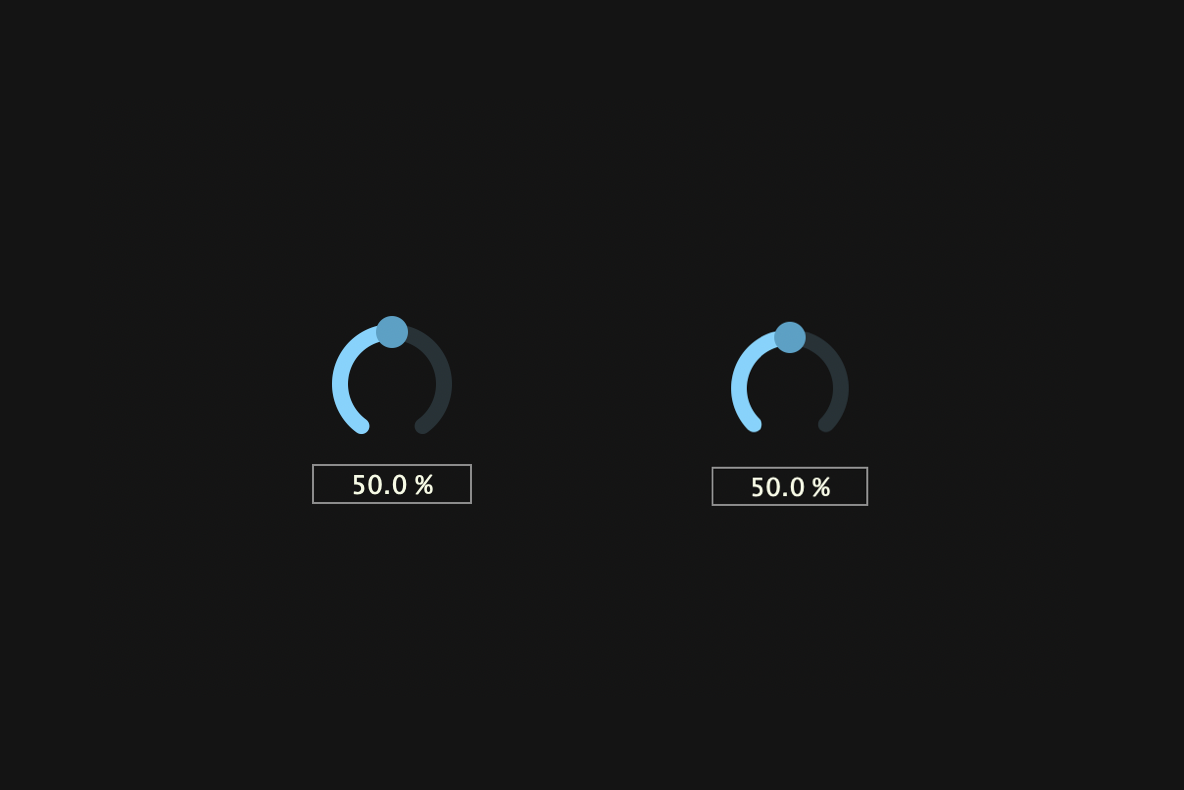
setRotaryParamters()
setRotaryParamters() sets the start and goal points of the dial in radians. The default setting is too wide a range of movement for the dial knob, so it is slightly narrowed.
Before(left) & After(right):
VelocityBasedMode
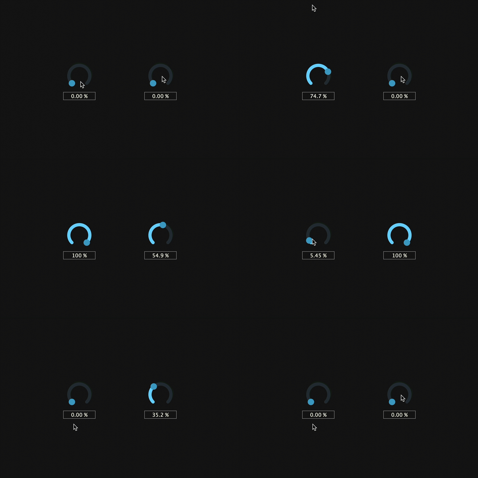
To enable VelocityBasedMode, pass true to setVelocityBasedMode(). Enabling this mode brings various benefits, such as adjusting the amount of value increase based on the speed of mouse dragging and mouse hiding while dragging. Also, by calling setVelocityModeParameters(), you can set detailed settings such as sensitivity, threshold, offset, etc. The example below shows the respective mouse drags when this mode is turned on and off.
off(left) / on(right):
setNumDecimalPlacesToDisplay()
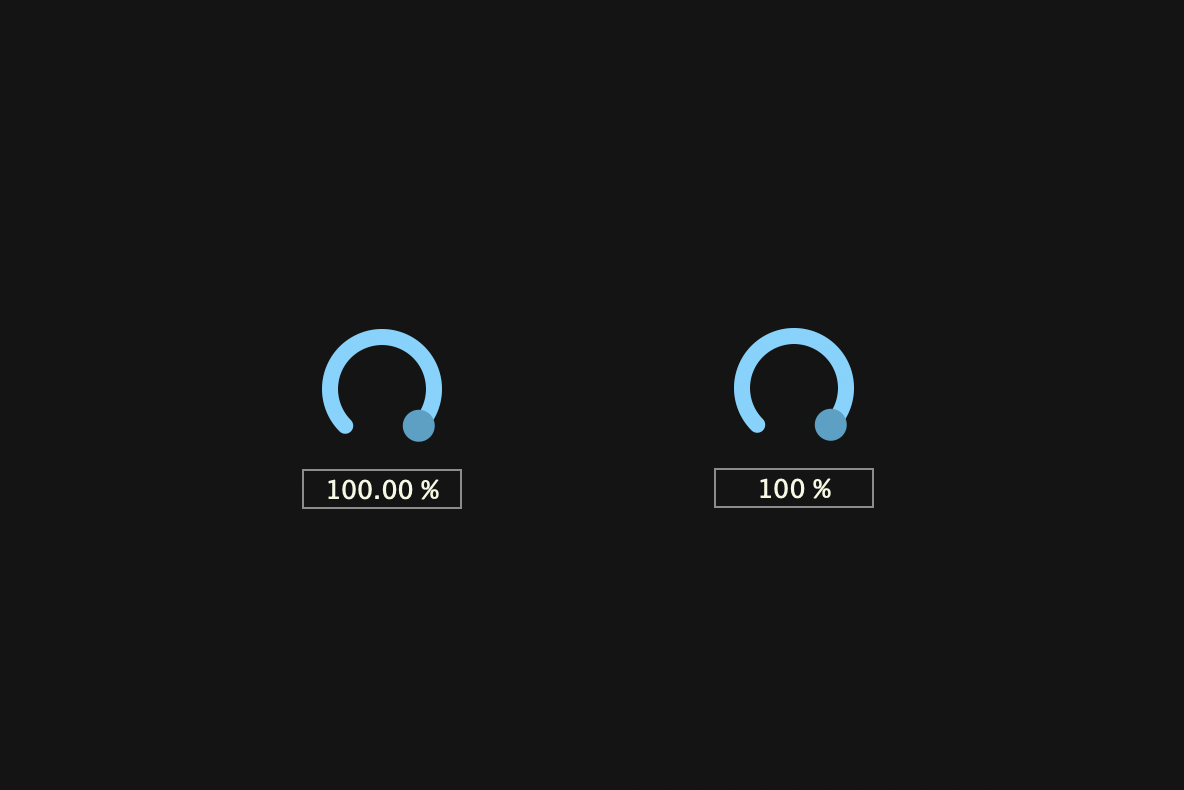
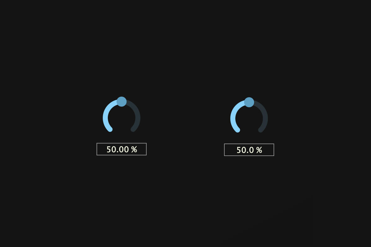
setNumDecimalPlacesToDisplay() modifies the decimal places of the values displayed in the slider text box. Using this member function and a lambda function called onValueChange, we set the value in the text box to always display three numbers.
At 100%, five numbers are redundant(Left):
Even at 50%, four numbers is redundant(Left):
Creating Dial objects
Now, create an object of the customized Dial class and display it in the editor. Be careful not to forget to include Dail.h and CustomColours.h.
MainComponent.h:
#pragma once

#include <JuceHeader.h>
#include "Dial.h"
#include "CustomColours.h"

class MainComponent  : public juce::Component
{
・・・
private:
    Dial dial;

    JUCE_DECLARE_NON_COPYABLE_WITH_LEAK_DETECTOR (MainComponent)
};
MainComponent.cpp:
#include "MainComponent.h"

MainComponent::MainComponent()
{
    setSize (600, 400);

    addAndMakeVisible (dial);
}

MainComponent::~MainComponent()
{
}

void MainComponent::paint (juce::Graphics& g)
{
    g.fillAll (CustomColours::black);
}

void MainComponent::resized()
{
    dial.setBounds (getLocalBounds().withSizeKeepingCentre (100, 100));
}
Building

LookAndFeel
In this chapter, we will customize LookAndFeel class to create the following dial:

Customizing LookAndFeel
I will first show the overall implementation, and then explain each member function.
#pragma once

#include <JuceHeader.h>
#include "CustomColours.h"

class CustomLookAndFeel : public juce::LookAndFeel_V4
{
public:
    CustomLookAndFeel();
    ~CustomLookAndFeel();

    juce::Slider::SliderLayout getSliderLayout (juce::Slider& slider) override;

    void drawRotarySlider (juce::Graphics&, int x, int y, int width, int height,
                           float sliderPosProportional, float rotaryStartAngle,
                           float rotaryEndAngle, juce::Slider&) override;

    juce::Label* createSliderTextBox (juce::Slider& slider) override;
};
#include "CustomLookAndFeel.h"

CustomLookAndFeel::CustomLookAndFeel() {};
CustomLookAndFeel::~CustomLookAndFeel() {};

juce::Slider::SliderLayout CustomLookAndFeel::getSliderLayout (juce::Slider& slider)
{
    auto localBounds = slider.getLocalBounds();

    juce::Slider::SliderLayout layout;

    layout.textBoxBounds = localBounds.withY (-1);
    layout.sliderBounds = localBounds;

    return layout;
}

void CustomLookAndFeel::drawRotarySlider (juce::Graphics& g, int x, int y, int width, int height, float sliderPos,
                                          const float rotaryStartAngle, const float rotaryEndAngle, juce::Slider& slider)
{
    auto fill = slider.findColour (juce::Slider::rotarySliderFillColourId);

    auto bounds = juce::Rectangle<float> (x, y, width, height).reduced (2.0f);
    auto radius = juce::jmin (bounds.getWidth(), bounds.getHeight()) / 2.0f;
    auto toAngle = rotaryStartAngle + sliderPos * (rotaryEndAngle - rotaryStartAngle);
    auto lineW = radius * 0.085f;
    auto arcRadius = radius - lineW * 1.6f;

    juce::Path backgroundArc;
    backgroundArc.addCentredArc (bounds.getCentreX(),
                                 bounds.getCentreY(),
                                 arcRadius,
                                 arcRadius,
                                 0.0f,
                                 rotaryStartAngle,
                                 rotaryEndAngle,
                                 true);

    g.setColour (CustomColours::blackGrey);
    g.strokePath (backgroundArc, juce::PathStrokeType (lineW, juce::PathStrokeType::curved, juce::PathStrokeType::rounded));

    juce::Path valueArc;
    valueArc.addCentredArc (bounds.getCentreX(),
                            bounds.getCentreY(),
                            arcRadius,
                            arcRadius,
                            0.0f,
                            rotaryStartAngle,
                            toAngle,
                            true);

    g.setColour (fill);
    g.strokePath (valueArc, juce::PathStrokeType (lineW, juce::PathStrokeType::curved, juce::PathStrokeType::rounded));

    juce::Path stick;
    auto stickWidth = lineW * 2.0f;

    stick.addRectangle (-stickWidth / 2, -stickWidth / 2, stickWidth, radius + lineW);

    g.setColour (CustomColours::creamWhite);
    g.fillPath (stick, juce::AffineTransform::rotation (toAngle + 3.12f).translated (bounds.getCentre()));

    g.fillEllipse (bounds.reduced (radius * 0.25));
}

juce::Label* CustomLookAndFeel::createSliderTextBox (juce::Slider& slider)
{
    auto* l = new juce::Label();

    l->setJustificationType (juce::Justification::centred);
    l->setColour (juce::Label::textColourId, slider.findColour (juce::Slider::textBoxTextColourId));
    l->setColour (juce::Label::textWhenEditingColourId, slider.findColour (juce::Slider::textBoxTextColourId));
    l->setColour (juce::Label::outlineWhenEditingColourId, juce::Colours::transparentWhite);
    l->setInterceptsMouseClicks (false, false);
    l->setFont (18.0f);

    return l;
}
getSliderLayout()
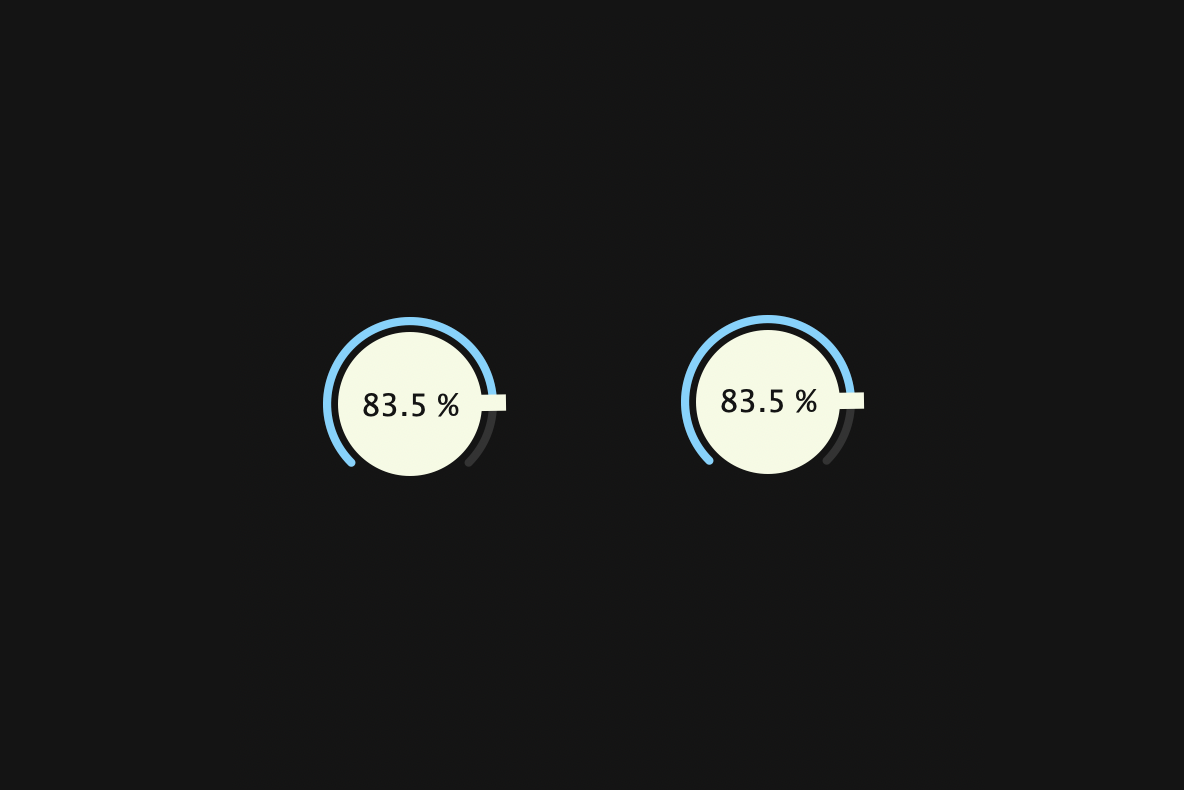
getSliderLayout() is a function that returns the slider layout, which is the position of the slider and text box. By overriding this function, you can change the layout as you wish. In this case, we implemented it so that the text box is centered on the slider.
juce::Slider::SliderLayout CustomLookAndFeel::getSliderLayout (juce::Slider& slider)
{
    auto localBounds = slider.getLocalBounds();

    juce::Slider::SliderLayout layout;

    layout.textBoxBounds = localBounds.withY (-1);
    layout.sliderBounds = localBounds;

    return layout;
}
Also, since the font is positioned a little lower, we have positioned the text box slightly higher by calling withY (-1).
Before(left) & After(right):
drawRotarySlider()
drawRotraySlider() is the member function that has the most impact on the appearance of a rotary-style slider. In order to make it easier to understand which part of the implementation describes what, I divided the implementation into smaller parts and added corresponding images to each part.
・・・
    juce::Path backgroundArc;
    backgroundArc.addCentredArc (bounds.getCentreX(),
                                 bounds.getCentreY(),
                                 arcRadius,
                                 arcRadius,
                                 0.0f,
                                 rotaryStartAngle,
                                 rotaryEndAngle,
                                 true);

    g.setColour (CustomColours::blackGrey);
    g.strokePath (backgroundArc, juce::PathStrokeType (lineW, juce::PathStrokeType::curved, juce::PathStrokeType::rounded));
・・・

・・・
    juce::Path valueArc;
    valueArc.addCentredArc (bounds.getCentreX(),
                            bounds.getCentreY(),
                            arcRadius,
                            arcRadius,
                            0.0f,
                            rotaryStartAngle,
                            toAngle,
                            true);

    g.setColour (fill);
    g.strokePath (valueArc, juce::PathStrokeType (lineW, juce::PathStrokeType::curved, juce::PathStrokeType::rounded));
・・・

・・・
    juce::Path stick;
    auto stickWidth = lineW * 2.0f;

    stick.addRectangle (-stickWidth / 2, -stickWidth / 2, stickWidth, radius + lineW);

    g.setColour (CustomColours::creamWhite);
    g.fillPath (stick, juce::AffineTransform::rotation (toAngle + 3.12f).translated (bounds.getCentre()));
・・・

・・・
    g.fillEllipse (bounds.reduced (radius * 0.25));
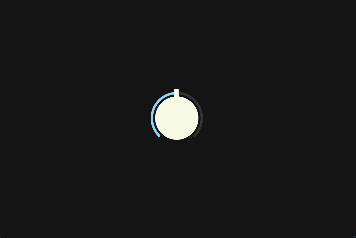
To understand these codes, it is essential to have an understanding of the juce::Graphics and juce::Path classes. I have previously posted an article with examples of the use of important member functions in these two classes, so please check this out if you are interested.
createSliderTextBox()
createSliderTextBox() is a member function for setting up a slider text box (juce::Label).
juce::Label* CustomLookAndFeel::createSliderTextBox (juce::Slider& slider)
{
    auto* l = new juce::Label();

    l->setJustificationType (juce::Justification::centred);
    l->setColour (juce::Label::textColourId, slider.findColour (juce::Slider::textBoxTextColourId));
    l->setColour (juce::Label::textWhenEditingColourId, slider.findColour (juce::Slider::textBoxTextColourId));
    l->setColour (juce::Label::outlineWhenEditingColourId, juce::Colours::transparentWhite);
    l->setInterceptsMouseClicks (false, false);
    l->setFont (18.0f);

    return l;
}
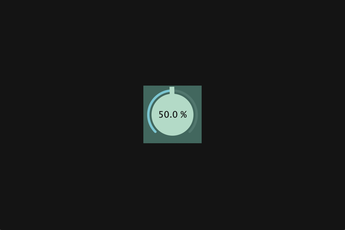
The most important function in this implementation part is setInterceptsMouseClicks(). This is a function that sets whether or not the target component will accept mouse clicks. In our case, we have a text box (painted in green to illustrate) covering the slider as shown below, so we need to pass false to this function to prevent the text box from accepting mouse clicks. Without doing this you will not be able to drag this dial.
Applying CustomLookAndFeel
When you have finished implementing CustomLookAndFeel, include this header file and create an object of this class.
Dial.h:
#include "CustomLookAndFeel.h"
class Dial  : public juce::Slider
{
・・・
private:
    CustomLookAndFeel customLookAndFeel;
};
Then, pass this object to setLookAndFeel() in the constructor below. Also, as a promise, pass a nullptr to setLookAndFeel() in the destructor:
Dial.cpp:
Dial::Dial()
{
・・・
//    setTextBoxStyle (juce::Slider::TextBoxBelow, false, 80, 20);
//    setColour (juce::Slider::textBoxTextColourId,    CustomColours::creamWhite);
    setColour (juce::Slider::textBoxTextColourId,    CustomColours::black);
・・・
    setLookAndFeel (&customLookAndFeel);
}

Dial::~Dial()
{
    setLookAndFeel (nullptr);
}
Remove setTextBoxStyle() as it is no longer needed due to the customization of getSliderLayout(). Then, change the text color of the text box from creamWhite to black.
Building

Focus Mark
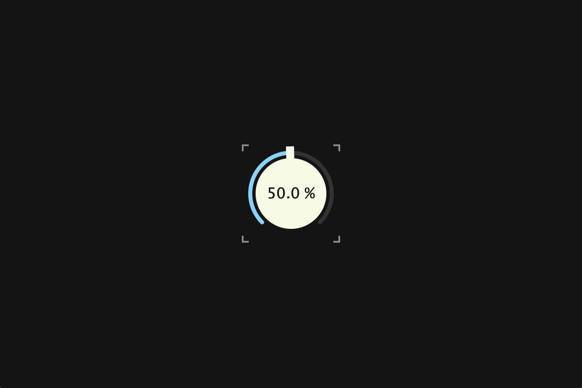
In this chapter, we will add a feature that will mark the dial when it is clicked.
Overriding paint()
Override paint() and branch the process by using hasKeyboardFocus() to determine if the component has KeyboardFocus, and if true, the mark will be drawn.
Dial.h:
class Dial  : public juce::Slider
{
public:
    Dial();
    ~Dial();

    void paint (juce::Graphics& g) override;
・・・
};
Dial.cpp:
void Dial::paint (juce::Graphics& g)
{
    juce::Slider::paint (g);

    if (hasKeyboardFocus (true))
    {
        auto bounds = getLocalBounds().toFloat();
        auto len    = juce::jmin (bounds.getHeight(), bounds.getWidth()) * 0.07f;
        auto thick  = len * 0.5f;

        auto topLeft     = bounds.getTopLeft();
        auto topRight    = bounds.getTopRight();
        auto bottomLeft  = bounds.getBottomLeft();
        auto bottomRight = bounds.getBottomRight();

        g.setColour (findColour (juce::Slider::textBoxOutlineColourId));

        juce::Path topLeftPath;
        topLeftPath.startNewSubPath (topLeft);
        topLeftPath.lineTo (topLeft.x, topLeft.y + len);
        topLeftPath.startNewSubPath (topLeft);
        topLeftPath.lineTo (topLeft.x + len, topLeft.y);
        g.strokePath (topLeftPath, juce::PathStrokeType (thick));

        juce::Path topRightPath;
        topRightPath.startNewSubPath (topRight);
        topRightPath.lineTo (topRight.x, topRight.y + len);
        topRightPath.startNewSubPath (topRight);
        topRightPath.lineTo (topRight.x - len, topRight.y);
        g.strokePath (topRightPath, juce::PathStrokeType (thick));

        juce::Path bottomLeftPath;
        bottomLeftPath.startNewSubPath (bottomLeft);
        bottomLeftPath.lineTo (bottomLeft.x, bottomLeft.y - len);
        bottomLeftPath.startNewSubPath (bottomLeft);
        bottomLeftPath.lineTo (bottomLeft.x + len, bottomLeft.y);
        g.strokePath (bottomLeftPath, juce::PathStrokeType (thick));

        juce::Path bottomRightPath;
        bottomRightPath.startNewSubPath (bottomRight);
        bottomRightPath.lineTo (bottomRight.x, bottomRight.y - len);
        bottomRightPath.startNewSubPath (bottomRight);
        bottomRightPath.lineTo (bottomRight.x - len, bottomRight.y);
        g.strokePath (bottomRightPath, juce::PathStrokeType (thick));
    }
}
setWantsKeyboardFocus()
This is not enough, we need to pass true to setWantsKeyboardFocus() so that the component can gain KeyboardFocus. Also, pass true to setWantsKeyboardFocus() to MainComponent so that when you click anywhere in the Editor other than the dial, the dial's KeyboardFocus will be lost.
Dial.cpp:
Dial::Dial()
{
・・・
    setWantsKeyboardFocus (true);
}
MainComponent.cpp:
MainComponent::MainComponent()
{
・・・
    setWantsKeyboardFocus (true);
}
Building

Font Embedding
In this chapter, we will embed the Futura Medium Font and apply it to the dial.

Futura Medium Font
I'm sorry that this explanation is for macOS users.
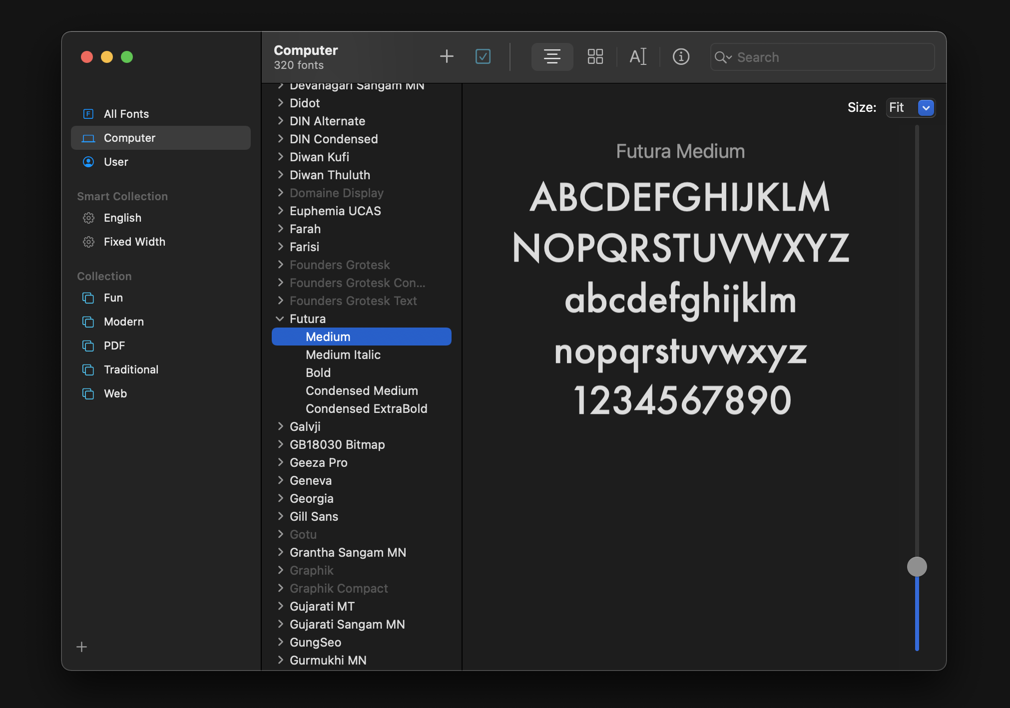
Launch Font Book application and look for Futura Medium Font. If there is another font you like, you can choose it.
Converting TTC to TTF
Use Finder application to show where this Font is on your system:
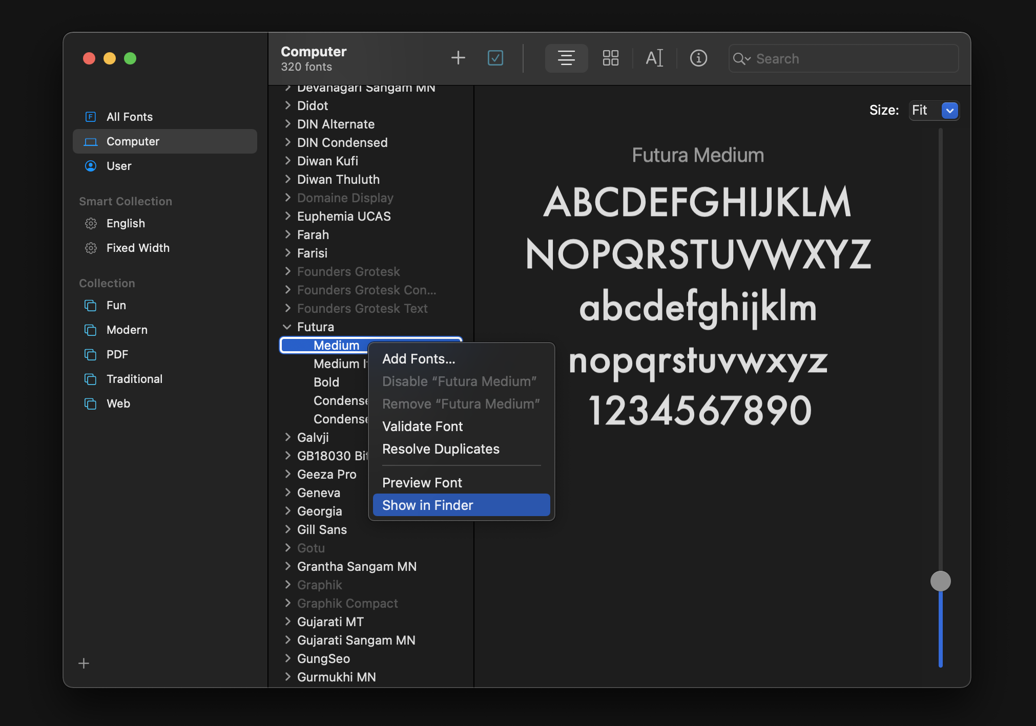
You can find the .ttc file in this way.
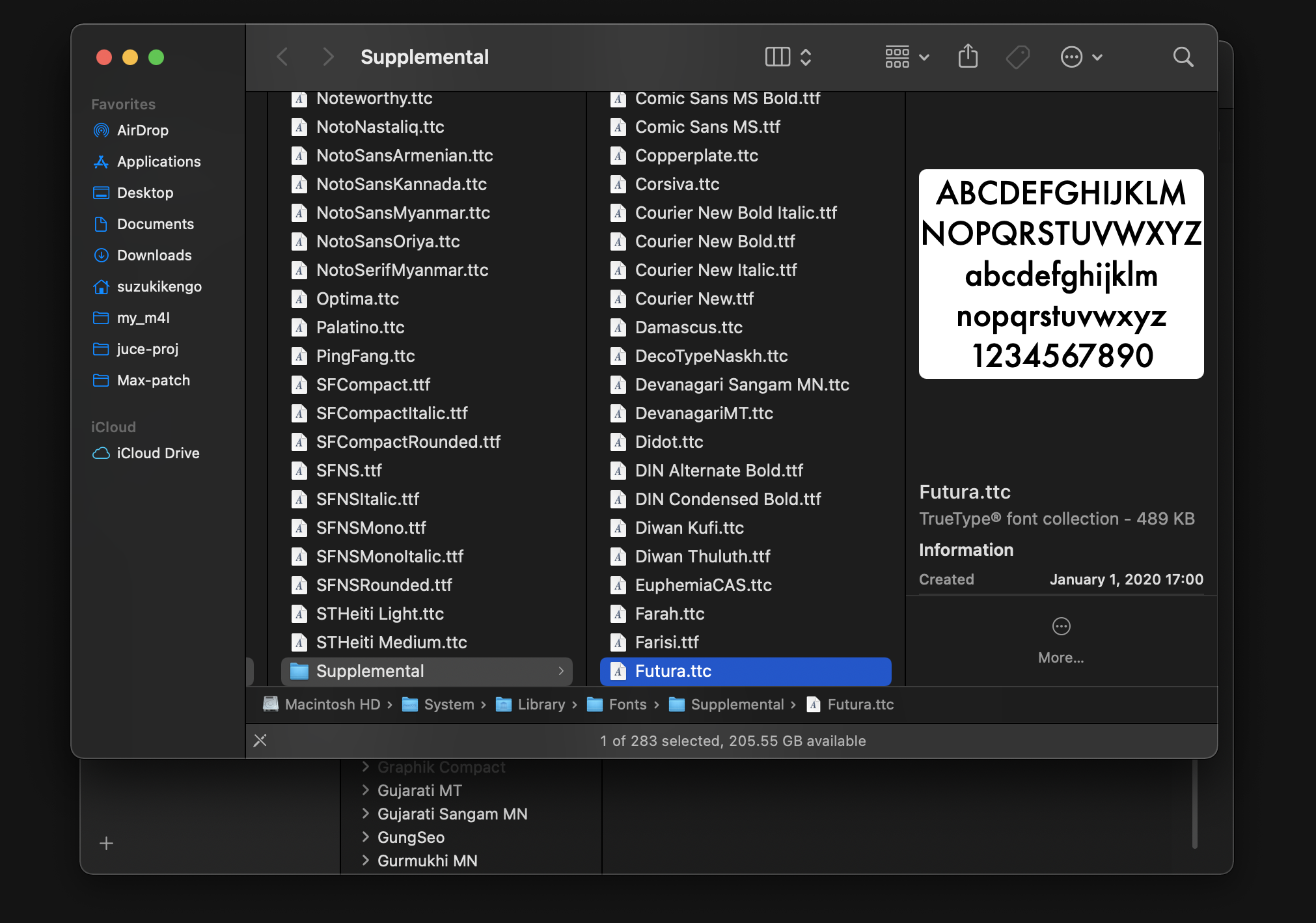
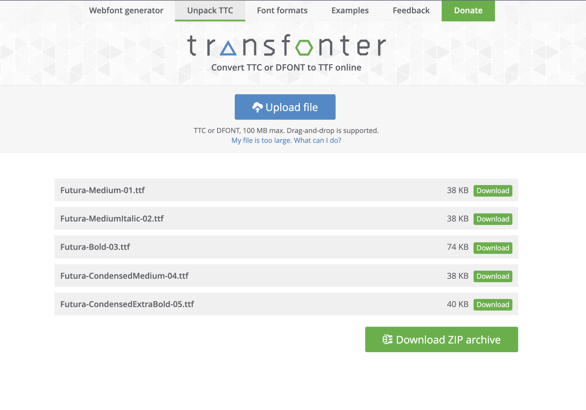
A .ttc file is like a collection of .ttf files, and in the case of Futura.ttc, it contains the following .ttf files
- Futura-Medium.ttf
- Futura-MediumItalic.ttf
- Futura-Bold.ttf
- Futura-CondensedMedium.ttf
- Futura-CondensedExtraBold.ttf
Since we only want to use Futura-Medium.ttf, please use the tool below to break down the .ttc file into multiple .ttf files and download only this Futura-Medium.ttf.
You can drag and drop it from the Finder to this site.
BinaryBuilder
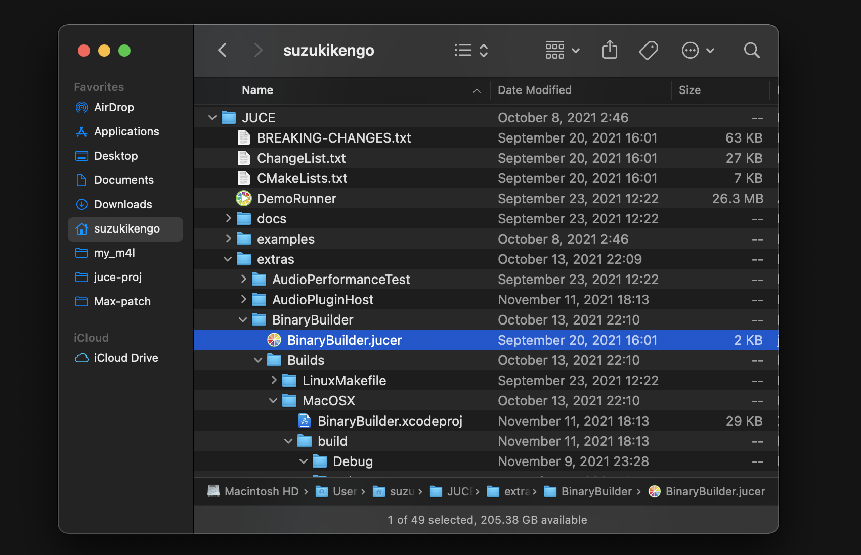
If you are new to BinaryBuilder, first open BinaryBuilder.jucer in the YOURPATH/JUCE/extras/BinaryBuilder directory with Projucer.
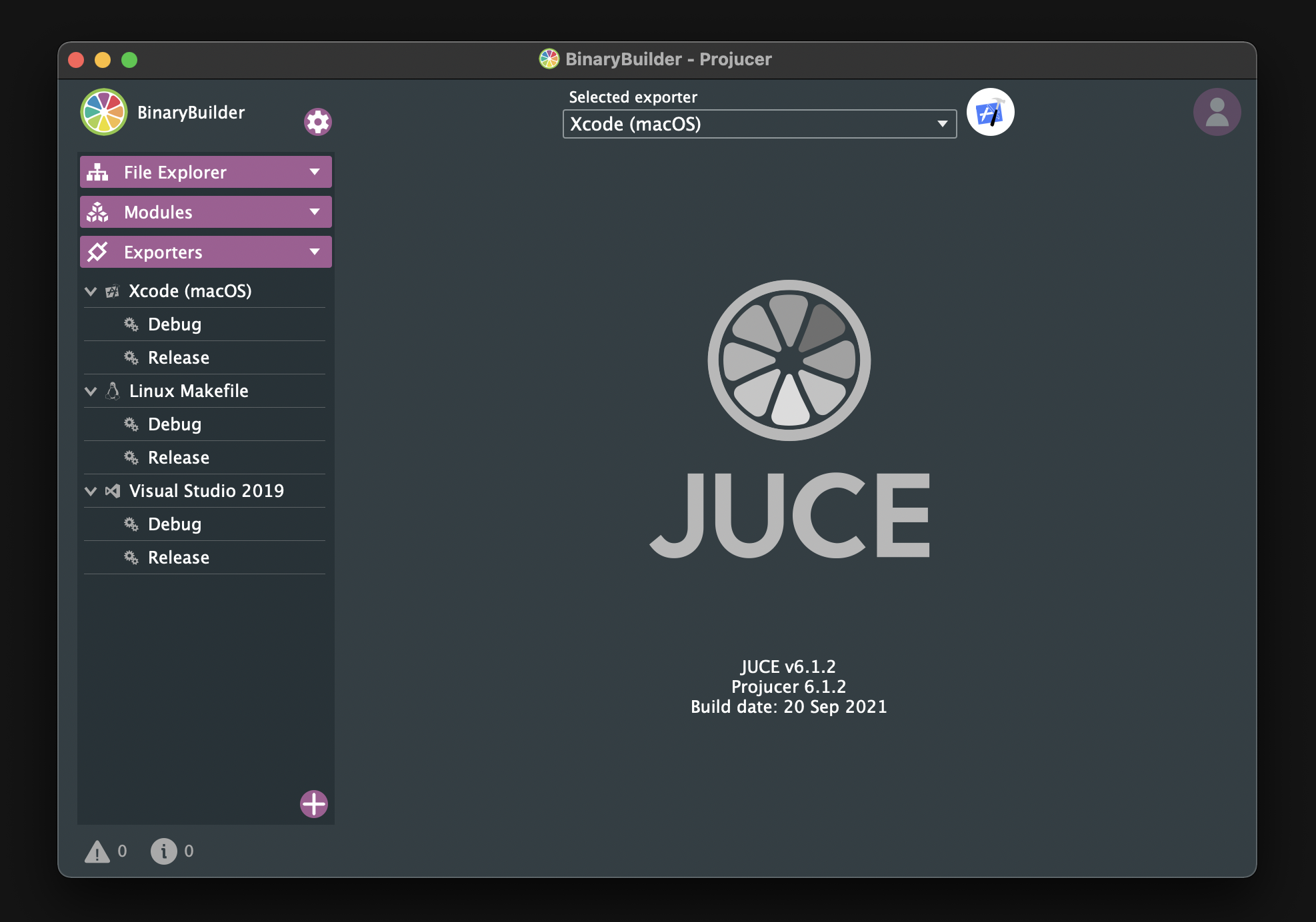
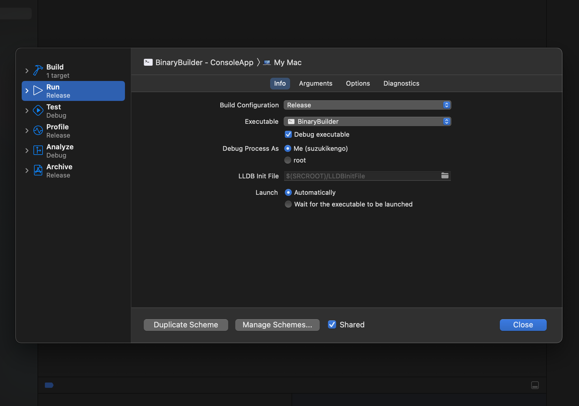
Open your IDE and select "Product"→"Scheme"→"Edit scheme" from the menu at the top of the screen. Then, change Build Configuration from Debug to Release as shown below, and build.
If the build is successful, you should find BinaryBuilder in the Release directory.
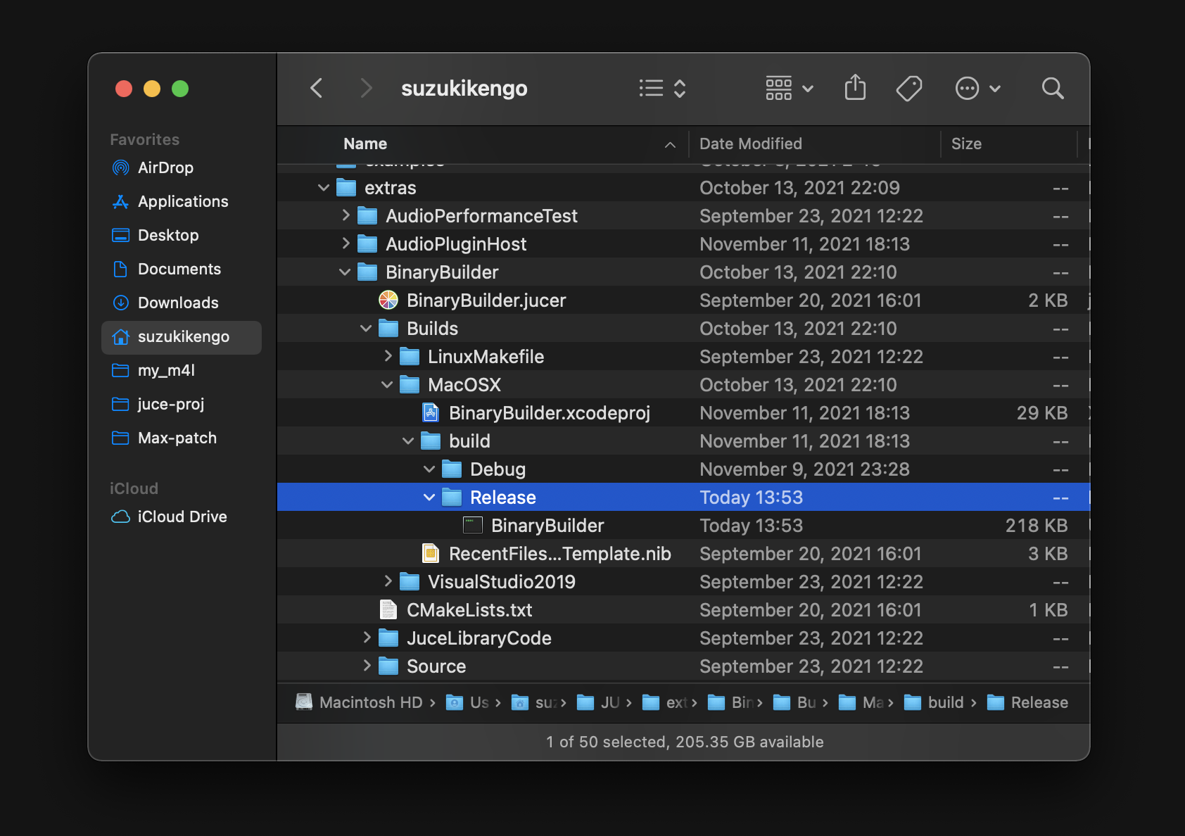
Next, move BinaryBuilder to a directory under your path so that you can execute the command by simply typing BinaryBuilder.
~
❯❯❯ mv /Users/suzukikengo/JUCE/extras/BinaryBuilder/Builds/MacOSX/build/Release/BinaryBuilder /usr/local/bin
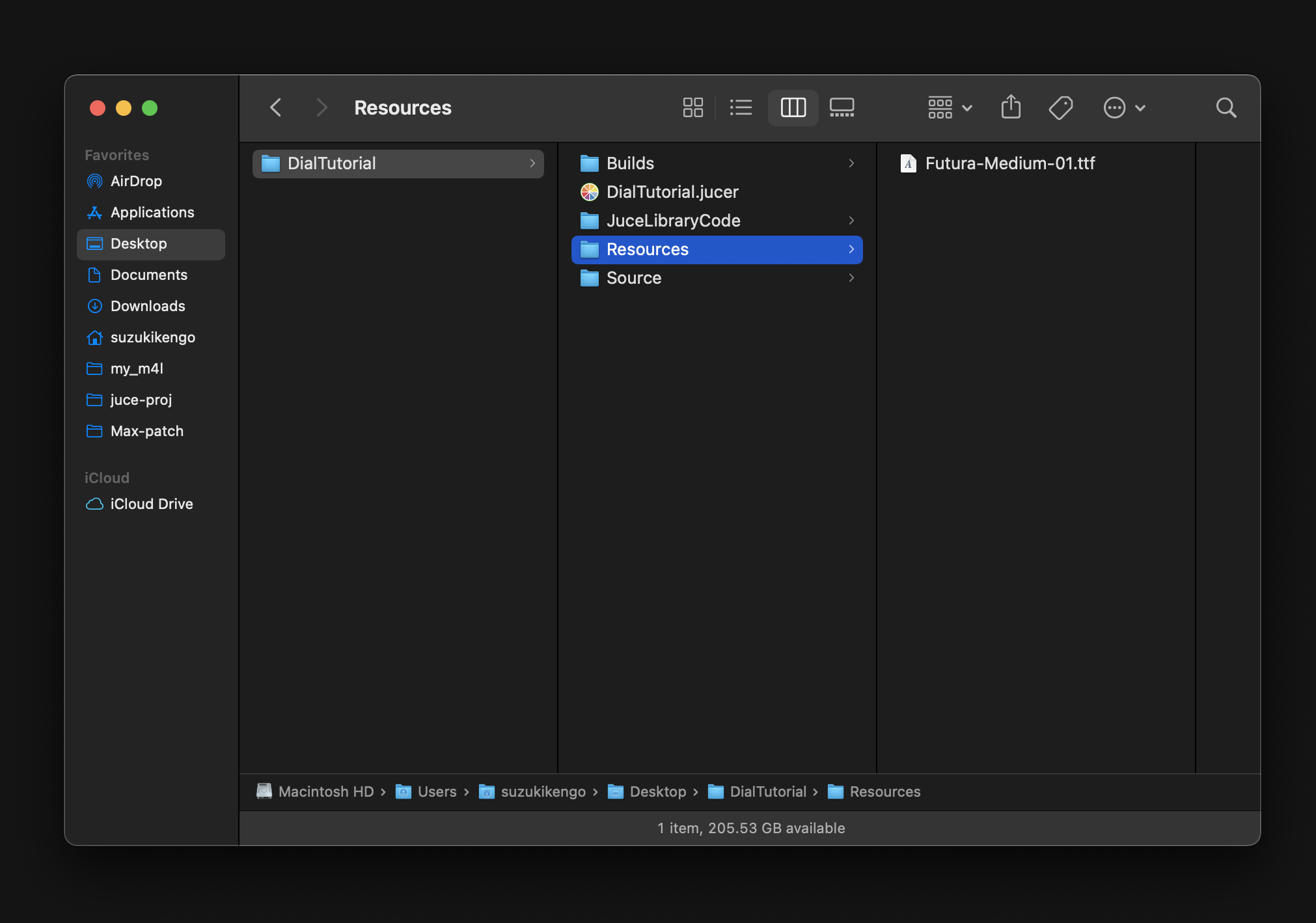
Create "Resources" directory under the DialTutorial project as the source and target directories to be used by BinaryBuilder, and add Futura-Medium.ttf file that you just downloaded under "Resources" directory.
You can check how to use BinaryBuilder by typing only the commands, for example:
~/Desktop/DialTutorial
❯❯❯ BinaryBuilder

 BinaryBuilder!  Visit www.juce.com for more info.
 Usage: BinaryBuilder  sourcedirectory targetdirectory targetclassname [optional wildcard pattern]

 BinaryBuilder will find all files in the source directory, and encode them
 into two files called (targetclassname).cpp and (targetclassname).h, which it
 will write into the target directory supplied.

 Any files in sub-directories of the source directory will be put into the
 resultant class, but #ifdef'ed out using the name of the sub-directory (hard to
 explain, but obvious when you try it...)
In the case of this tutorial, the argument will look like this:
~/Desktop/DialTutorial
❯❯❯ BinaryBuilder Resources Resources FuturaMedium

 BinaryBuilder!  Visit www.juce.com for more info.
Creating /Users/suzukikengo/Desktop/DialTutorial/Resources/FuturaMedium.h and /Users/suzukikengo/Desktop/DialTutorial/Resources/FuturaMedium.cpp from files in /Users/suzukikengo/Desktop/DialTutorial/Resources...

Adding FuturaMedium01_ttf: 37516 bytes

 Total size of binary data: 37516 bytes
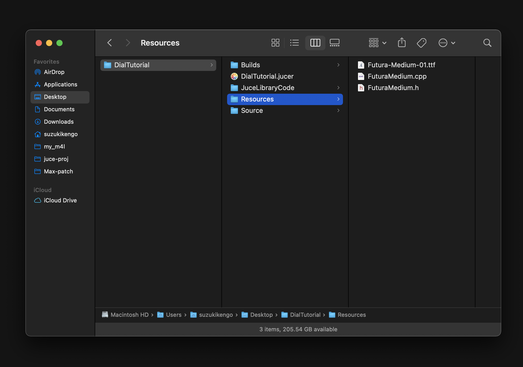
After running, the .h/.cpp files for the fonts will be created in Resources directory:
Then follow the steps below to load Resources directory into Projucer.
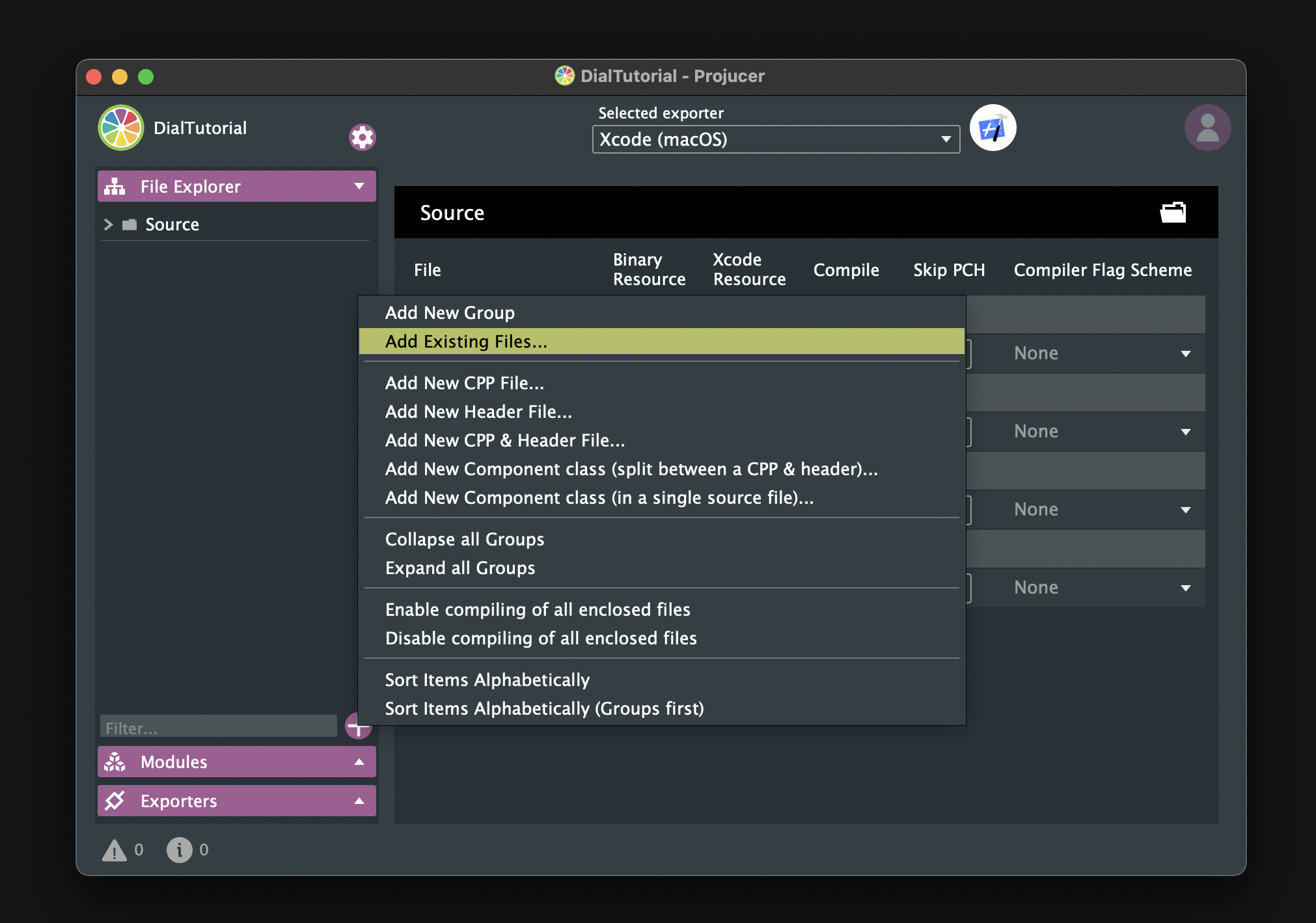
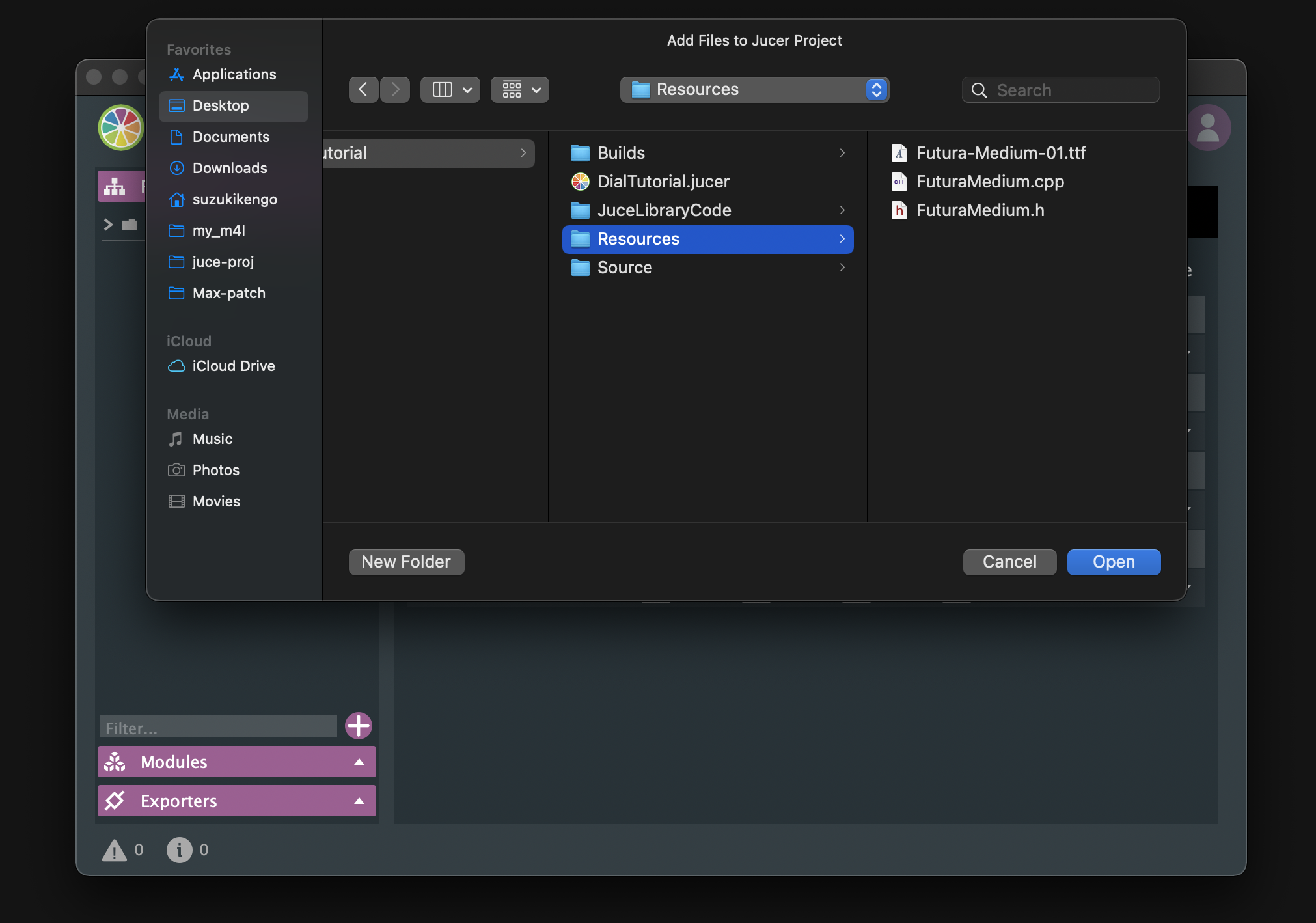
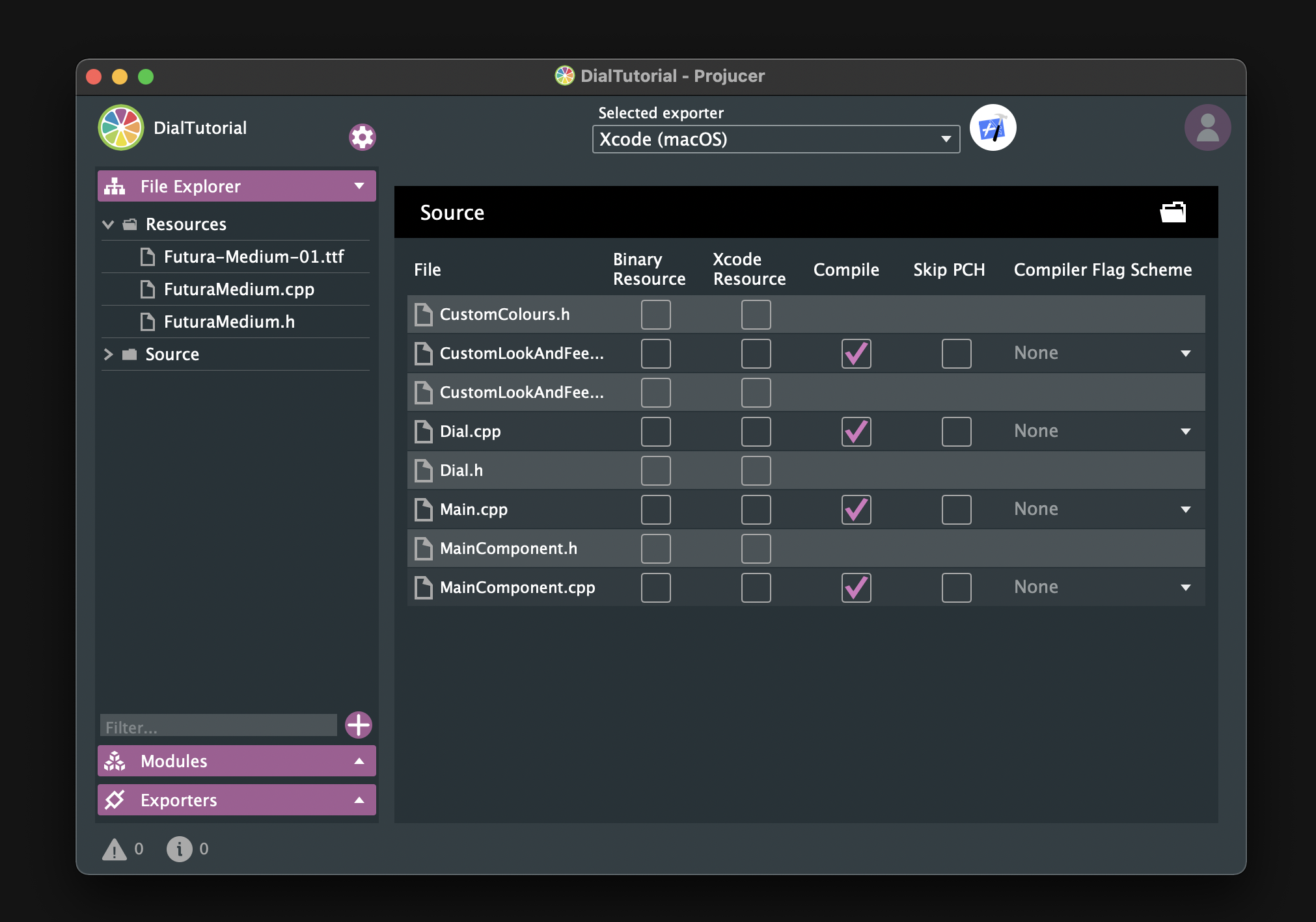
Setting font
Now, include FuturaMedium.h in CustomLookAndFeel.h.
#include "../Resources/FuturaMedium.h"
setDefaultSansSerifTypeface()
Create Futura Medium font by calling createSystemTypefaceFor() and set it as the default sans-serif font by passing it to setDefaultSansSerifTypeface().
CustomLookAndFeel.cpp:
CustomLookAndFeel::CustomLookAndFeel()
{
    auto futuraMediumFont = juce::Typeface::createSystemTypefaceFor (FuturaMedium::FuturaMedium01_ttf,
                                                                     FuturaMedium::FuturaMedium01_ttfSize);
    setDefaultSansSerifTypeface (futuraMediumFont);
};
setDefaultLookAndFeel()
Now, to apply this font, we just need to pass an object of the CustomLookAndFeel class to setDefaultLookAndFeel() in MainComponent.
MainComponent.h:
#inlcude "CustomLookAndFeel.h"
class MainComponent  : public juce::Component
{
・・・
private:
・・・
    CustomLookAndFeel customLookAndFeel;
・・・
};
MainComponent.cpp:
MainComponent::MainComponent()
{
・・・
    juce::LookAndFeel::setDefaultLookAndFeel (&customLookAndFeel);
}

MainComponent::~MainComponent()
{
    juce::LookAndFeel::setDefaultLookAndFeel (nullptr);
}
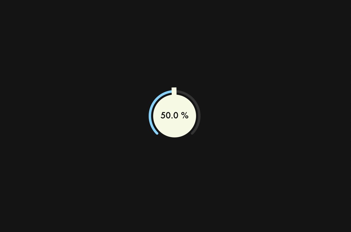
Building
Oops, the text was too small, so make it a little bigger before you build it.
CustomLookAndFeel.cpp:
juce::Label* CustomLookAndFeel::createSliderTextBox (juce::Slider& slider)
{
・・・
    l->setFont (20.0f);
・・・
}

Drag Sensitivity
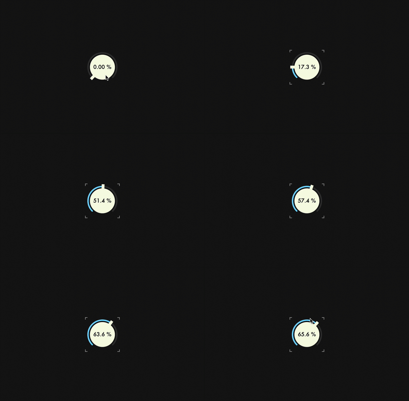
In this chapter, we will add a feature to multiply the sensitivity by 0.1 while dragging the mouse, by pressing the Shift key. This feature will allow you to fine tune the value of the dial.
isShiftDown()
isShiftDown() is a member function that returns true if the Shift key's flag is set, and you can access key modifiers associated with mouse events through mods.
Override mouseDrag() and make it conditional by isShiftDown() so that the first argument of setVelocityModeParameters() is set to 0.1 if true, and 1.0 as usual if false.
class Dial  : public juce::Slider
{
public:
・・・
    void mouseDrag (const juce::MouseEvent& event) override;
void Dial::mouseDrag (const juce::MouseEvent& event)
{
    juce::Slider::mouseDrag (event);

    if (event.mods.isShiftDown())
        setVelocityModeParameters (0.1, 1, 0.1, false);
    else
        setVelocityModeParameters (1.0, 1, 0.1, false);
}
Building

Edit Mode
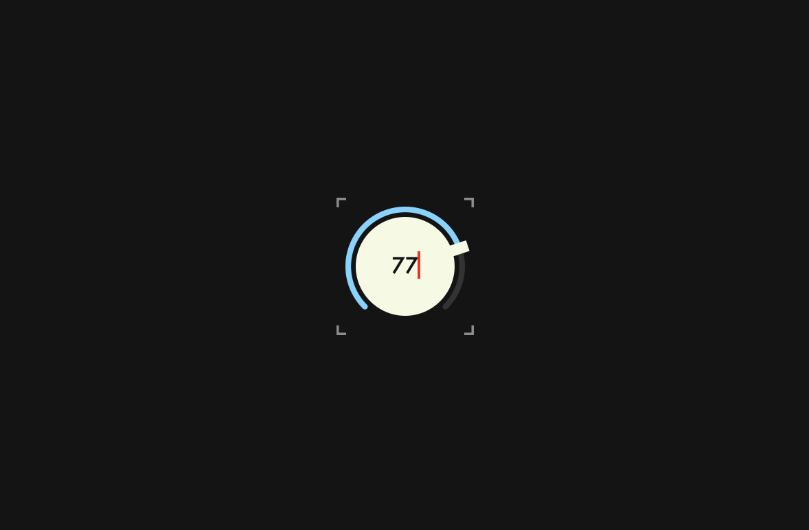
In this chapter, we will add a mode that allows you to edit the text box.
Customizing label
Since the dial text box is a juce::Label object returned by createSliderTextBox(), prepare a CustomLabel class and change the return value of this function to an object of this class.
First, I will show the overall implementation of CustomLabel class, and then explain each member function.
CustomLookAndFeel.h:
class CustomLookAndFeel : public juce::LookAndFeel_V4
{
public:
    struct CustomLabel : public juce::Label
    {
        static juce::String initialPressedKey;

        juce::TextEditor* createEditorComponent() override
        {
            auto* ed = juce::Label::createEditorComponent();

            ed->setJustification (juce::Justification::centred);
            ed->setColour (juce::TextEditor::backgroundColourId, juce::Colours::transparentWhite);
            ed->setInputRestrictions (5, "0123456789.");
            ed->setIndents (4, 0);

            return ed;
        }

        void editorShown (juce::TextEditor* editor) override
        {
            getParentComponent()->setMouseCursor (juce::MouseCursor::NoCursor);
            editor->clear();
            editor->setText (initialPressedKey);
        }

        void editorAboutToBeHidden (juce::TextEditor * ed) override
        {
            getParentComponent()->setMouseCursor (juce::MouseCursor::NormalCursor);
        }
    };
・・・
CustomLookAndFeel.cpp
juce::String CustomLookAndFeel::CustomLabel::initialPressedKey = "";

CustomLookAndFeel::CustomLookAndFeel()
{
・・・
createEditorComponent()
Override createEditorComponent() to set the details of the TextEditor object, which is called when the text box label goes into edit mode.
juce::TextEditor* createEditorComponent() override
{
    auto* ed = juce::Label::createEditorComponent();

    ed->setJustification (juce::Justification::centred);
    ed->setColour (juce::TextEditor::backgroundColourId, juce::Colours::transparentWhite);
    ed->setInputRestrictions (5, "0123456789.");
    ed->setIndents (4, 0);

    return ed;
}
If you don't use setInputRestrictions(), you can have non-numeric characters, and also an unlimited number of input characters, so it will look like the following:

This time we limit the number of characters we can enter to five, and the only characters we can enter are numbers and a period representing a decimal point.
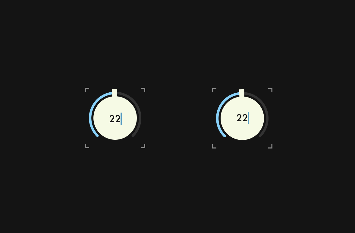
Then it is also important to use setIndents(). If you do not use this function, as shown in the left dial below, the position of the character you are editing will be set much lower:
editorShown()
editorShown() is a function that is called when a TextEditor object appears.
void editorShown (juce::TextEditor* editor) override
{
    getParentComponent()->setMouseCursor (juce::MouseCursor::NoCursor);
    editor->clear();
    editor->setText (initialPressedKey);
}
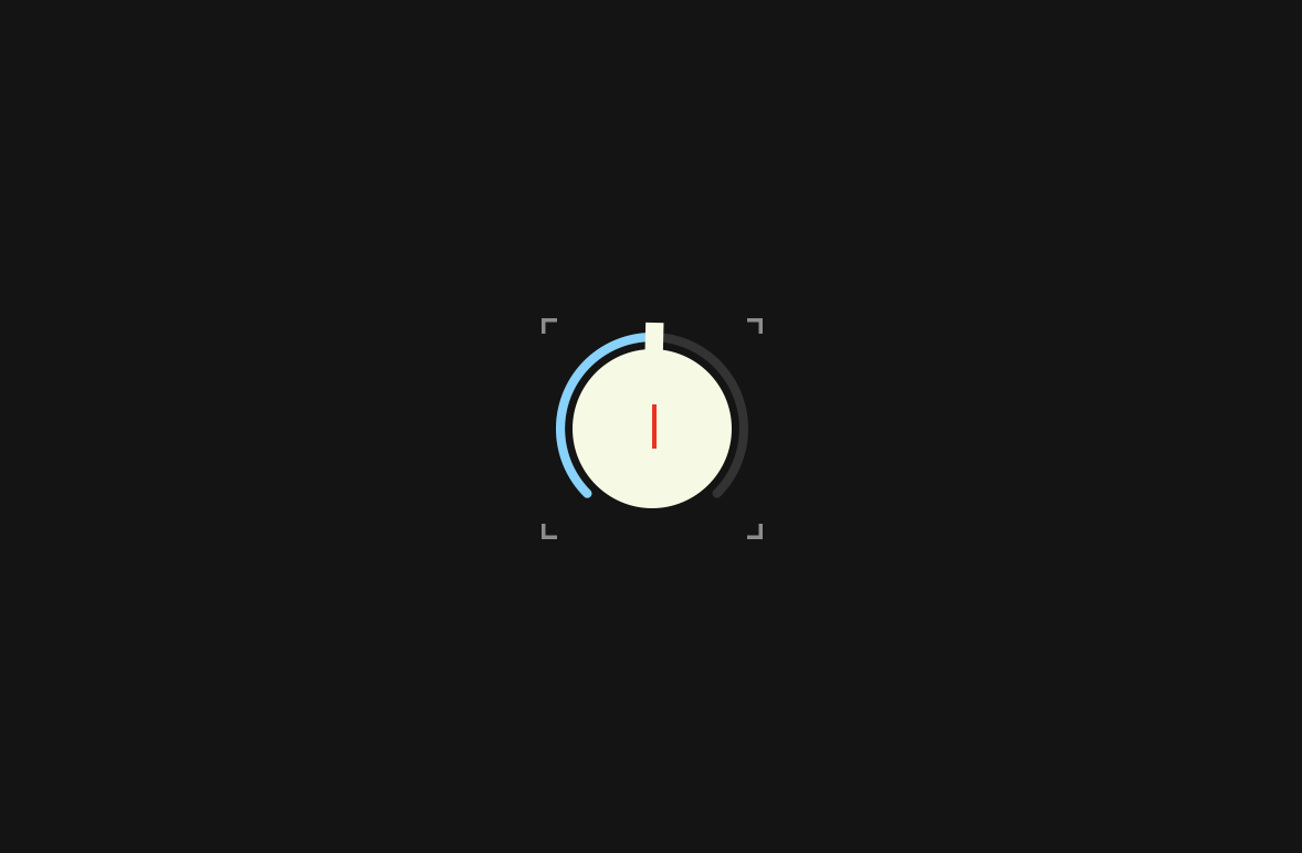
By default, when this function is called, the initial value is assigned as shown below:

It is not cool to leave it like this, so we call clear() to clear the initial value. We also want the initial value to be the value of the first numeric key entered, so we pass a static variable called initialPressedKey to setText(). This variable will be explained later.
editorAboutToBeHidden()
editorAboutToBeHidden() is a function that is called when the editing mode is terminated. editorShown() implemented the process of hiding the mouse cursor, so here we implement the process of making the mouse cursor visible.
void editorAboutToBeHidden (juce::TextEditor * ed) override
{
    getParentComponent()->setMouseCursor (juce::MouseCursor::NormalCursor);
}
createSliderTextBox()
Change the return value of createSliderTextBox() from juce::Label to CustomLabel.
class CustomLookAndFeel : public juce::LookAndFeel_V4
{
public:
・・・
    CustomLabel* createSliderTextBox (juce::Slider& slider) override;
CustomLookAndFeel::CustomLabel* CustomLookAndFeel::createSliderTextBox (juce::Slider& slider)
{
    auto* l = new CustomLabel();

    l->setJustificationType (juce::Justification::centred);
    l->setColour (juce::Label::textColourId, slider.findColour (juce::Slider::textBoxTextColourId));
    l->setColour (juce::Label::textWhenEditingColourId, slider.findColour (juce::Slider::textBoxTextColourId));
    l->setColour (juce::Label::outlineWhenEditingColourId, juce::Colours::transparentWhite);
    l->setInterceptsMouseClicks (false, false);
    l->setFont (20.0f);

    return l;
}
Customizing caret
To change the color of the caret from the default blue to red, override createCaretComponent().
class CustomLookAndFeel : public juce::LookAndFeel_V4
{
public:
・・・
    juce::CaretComponent* createCaretComponent (juce::Component* keyFocusOwner) override;
};
juce::CaretComponent* CustomLookAndFeel::createCaretComponent (juce::Component* keyFocusOwner)
{
    auto caret = new juce::CaretComponent (keyFocusOwner);

    caret->setColour (juce::CaretComponent::caretColourId, juce::Colours::red);

    return caret;
}
Overriding keyPressed()
Override keyPressed() so that the dial can detect the keystrokes and switch to edit mode.
class Dial  : public juce::Slider
{
public:
・・・
    bool keyPressed (const juce::KeyPress& k) override;
It responds only to numeric keys, and when a numeric key is pressed, the value of that key is assigned to the static variable initialPressedKey. This variable will be the initial value when the TextEditor object is displayed. If this is not implemented, the first numeric key pressed will only be treated as a trigger to switch to edit mode, and the value of that key will be ignored.
bool Dial::keyPressed (const juce::KeyPress& k)
{
    char numChars[] = "0123456789";

    for (auto numChar : numChars)
    {
        if (k.isKeyCode (numChar))
        {
            CustomLookAndFeel::CustomLabel::initialPressedKey = juce::String::charToString (numChar);
            showTextBox();

            return true;
        }
    }

    return false;
}
In the process of converting to GIF the redness of the caret was lost, but in fact it is red:

Building

Mouse Cursor
In this chapter, we will make some minor settings for the mouse cursor when controlling Dial.
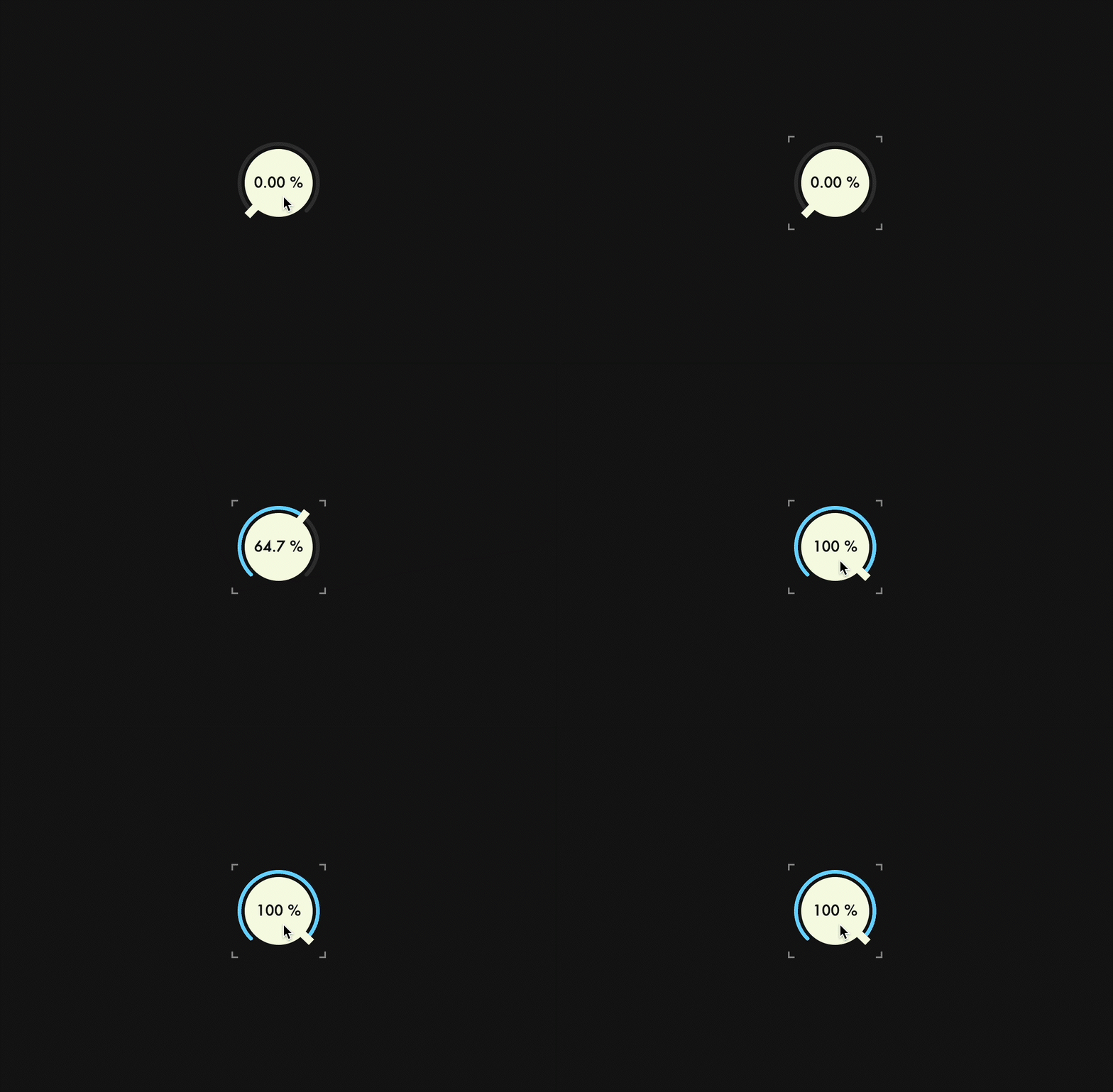
mouseDown()
In the current Dial, the mouse cursor disappears when you start dragging, but not the moment you click. To make the mouse cursor disappear even at this moment, override mouseDown() and pass juce::MouseCursor::NoCursor to setMouseCursor().
class Dial  : public juce::Slider
{
public:
・・・
    void mouseDown (const juce::MouseEvent& event) override;
void Dial::mouseDown (const juce::MouseEvent& event)
{
    juce::Slider::mouseDown (event);

    setMouseCursor (juce::MouseCursor::NoCursor);
}
mouseUp()
Then, we pass juce::MouseCursor::NormalCursor to setMouseCursor() so that the mouse cursor will appear when we have finished clicking or dragging.
class Dial  : public juce::Slider
{
public:
・・・
    void mouseUp (const juce::MouseEvent& event) override;
void Dial::mouseUp (const juce::MouseEvent& event)
{
    juce::Slider::mouseUp (event);

    juce::Desktop::getInstance().getMainMouseSource().setScreenPosition (event.source.getLastMouseDownPosition());

    setMouseCursor (juce::MouseCursor::NormalCursor);
}
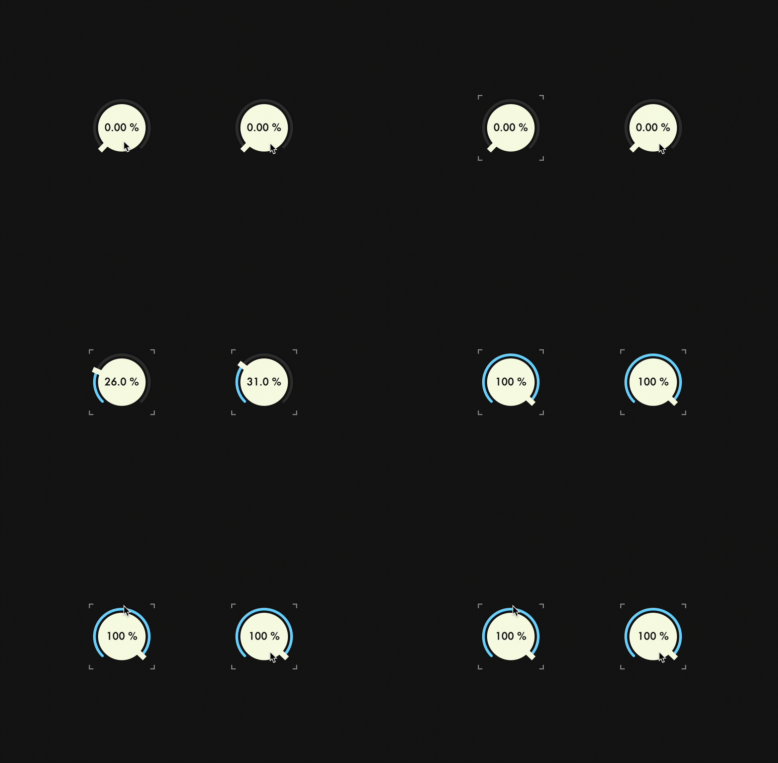
Also, we pass the value returned by getLastMouseDownPosition(), which is the last mouse clicked position, to setScreenPosition() to move the mouse cursor position. This will prevent the user from being confused by the cursor appearing in an unexpected place when the drag is finished.
Before(left) & After(right):
Summary
In the tutorial, I explained the following:
- How to create a basic dial
- How to customize LookAndFeel class
- How to embed fonts using BinaryBuilder
- How to implement essential features such as Edit Mode
Thank you for reading to the end. If you find any mistakes in this article, please let me know via Twitter DM or other means. Happy coding!