Introduction
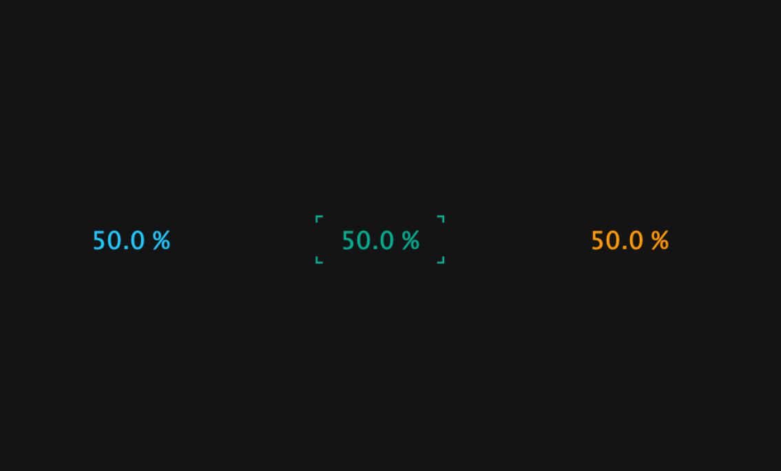
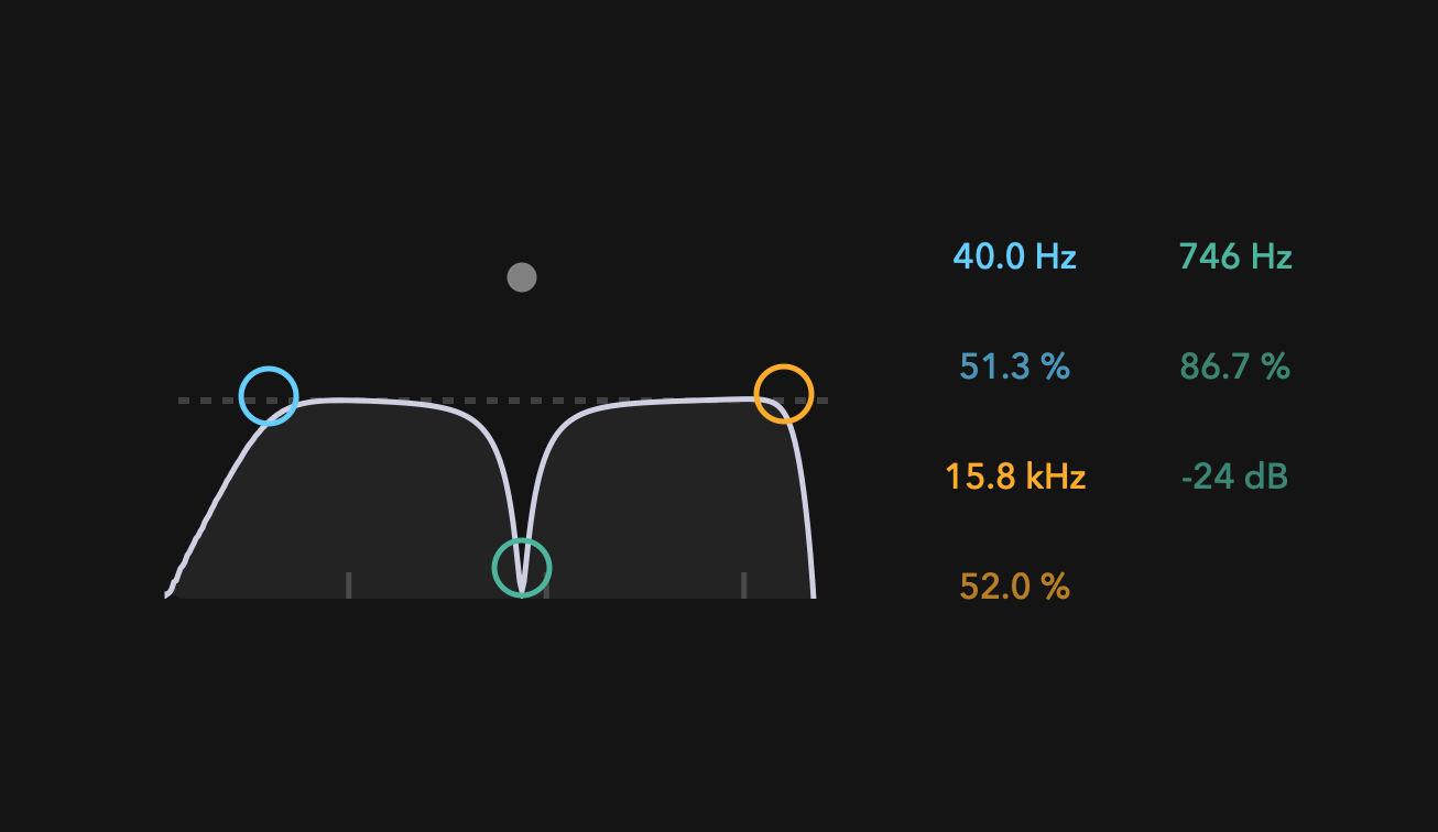
In this tutorial, I will show you how to make Ableton-style NumberBox with JUCE. The finished product is available in my repository below.
Let's get started!
Prerequisites
Before we dive into the tutorial, we need to do a little preparation.
First, create a new project called NumberBox.
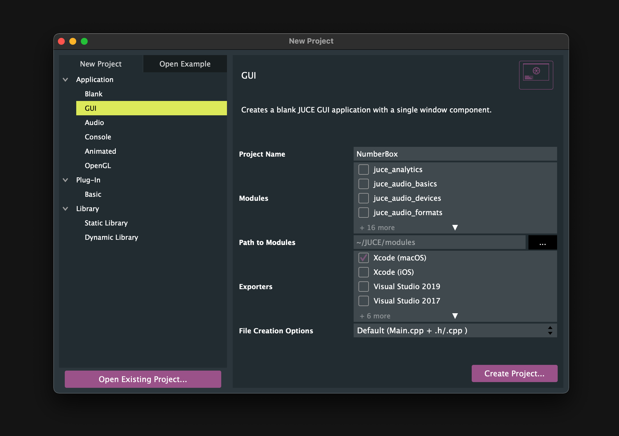
Then, prepare .h/.cpp files for NumberBox.
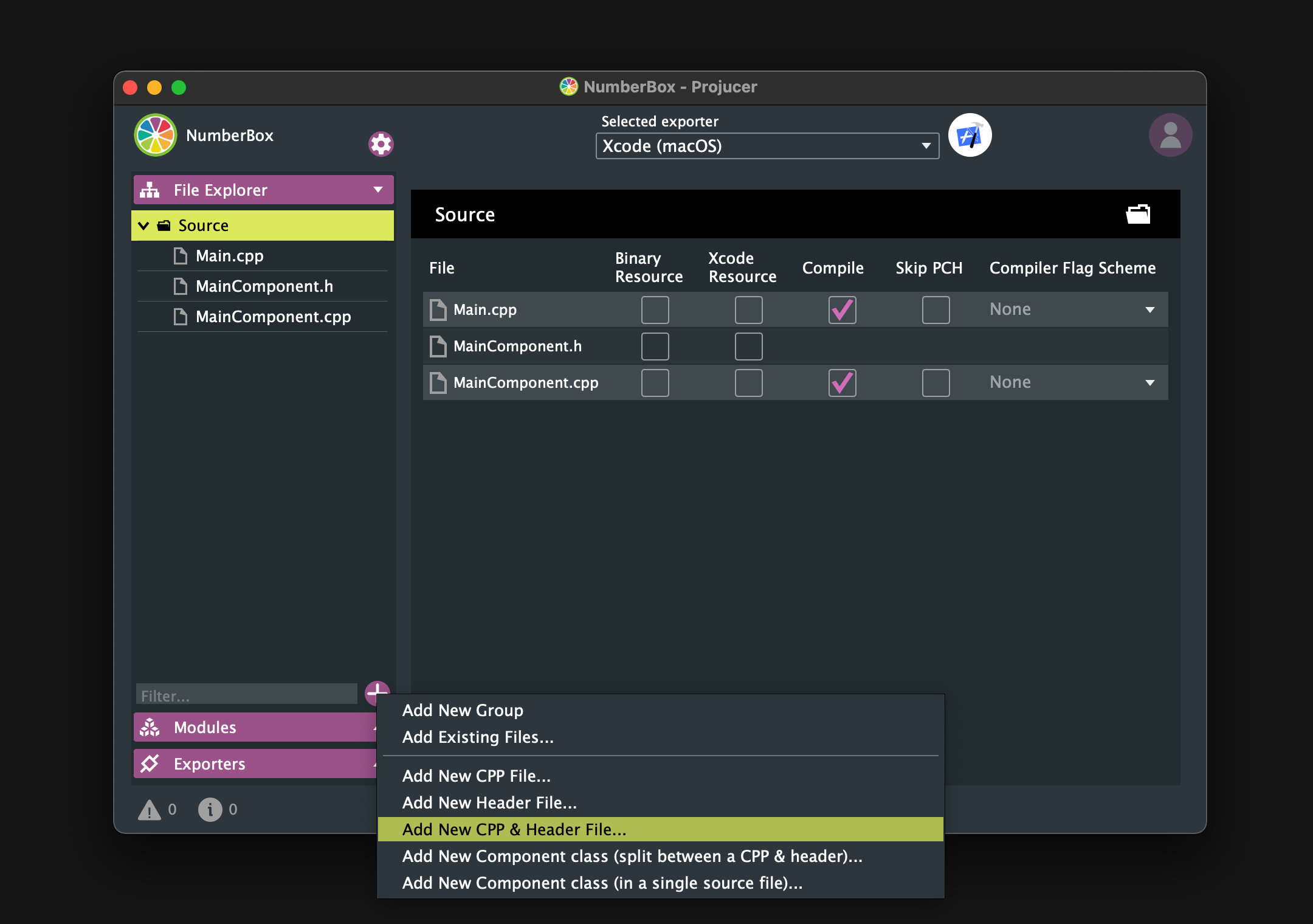
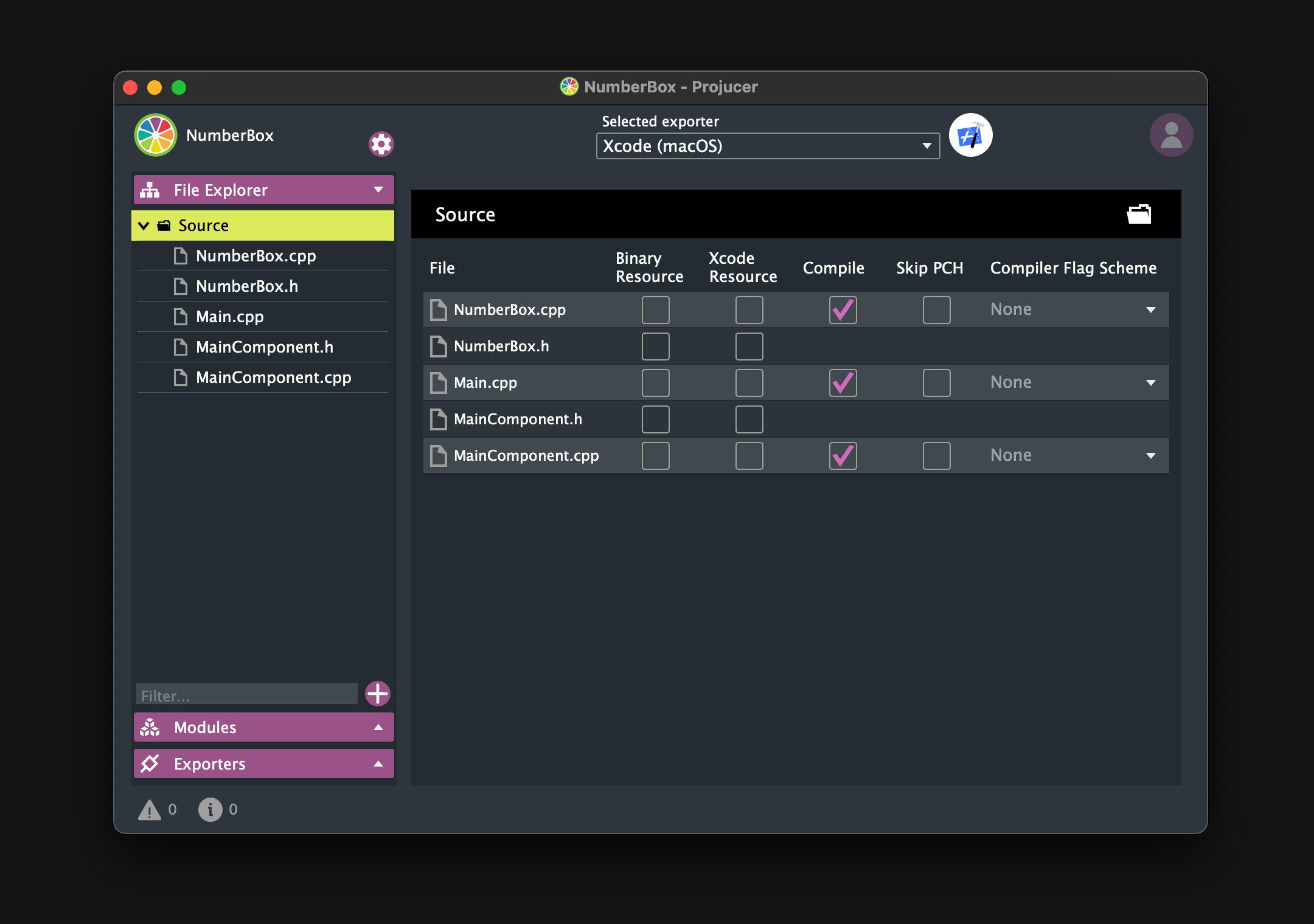
Make sure that the Source directory is the same as below.
Basic NumberBox
In this chapter, we will create NumberBox with the minimum required functionality.
Customizing Slider
NumberBox is mainly a component that can be dragged to change its value, so it is created by customizing juce::Slider.
First, I will show the entire implementation of the .h/.cpp file, and then I will explain the key points.
NumberBox.h:
#pragma once

#include <JuceHeader.h>

class NumberBox  : public juce::Slider
{
public:
    NumberBox();
    ~NumberBox();

    void paint (juce::Graphics& g) override;
    void mouseDown (const juce::MouseEvent& event) override;
    void mouseUp (const juce::MouseEvent& event) override;
};
NumberBox.cpp:
#include "NumberBox.h"

NumberBox::NumberBox()
{
    setSliderStyle (juce::Slider::LinearBarVertical);
    setColour (juce::Slider::trackColourId, juce::Colours::transparentWhite);
    setTextBoxIsEditable (false);
    setVelocityBasedMode (true);
    setVelocityModeParameters (0.5, 1, 0.09, false);
    setRange (0, 100, 0.01);
    setValue (50.0);
    setDoubleClickReturnValue (true, 50.0);
    setTextValueSuffix (" %");
    setWantsKeyboardFocus (true);
    onValueChange = [&]()
    {
        if (getValue() < 10)
            setNumDecimalPlacesToDisplay(2);
        else if (10 <= getValue() && getValue() < 100)
            setNumDecimalPlacesToDisplay(1);
        else
            setNumDecimalPlacesToDisplay(0);
    };
}

NumberBox::~NumberBox(){}

void NumberBox::paint (juce::Graphics& g)
{
    if (hasKeyboardFocus (false))
    {
        auto bounds = getLocalBounds().toFloat();
        auto h = bounds.getHeight();
        auto w = bounds.getWidth();
        auto len = juce::jmin (h, w) * 0.15f;
        auto thick  = len / 1.8f;

        g.setColour (findColour (juce::Slider::textBoxOutlineColourId));

        // Left top
        g.drawLine (0.0f, 0.0f, 0.0f, len, thick);
        g.drawLine (0.0f, 0.0f, len, 0.0f, thick);

        // Left bottom
        g.drawLine (0.0f, h, 0.0f, h - len, thick);
        g.drawLine (0.0f, h, len, h, thick);

        // Right top
        g.drawLine (w, 0.0f, w, len, thick);
        g.drawLine (w, 0.0f, w - len, 0.0f, thick);

        // Right bottom
        g.drawLine (w, h, w, h - len, thick);
        g.drawLine (w, h, w - len, h, thick);
    }
}

void NumberBox::mouseDown (const juce::MouseEvent& event)
{
    juce::Slider::mouseDown (event);

    setMouseCursor (juce::MouseCursor::NoCursor);
}

void NumberBox::mouseUp (const juce::MouseEvent& event)
{
    juce::Slider::mouseUp (event);

    juce::Desktop::getInstance().getMainMouseSource().setScreenPosition (event.source.getLastMouseDownPosition());

    setMouseCursor (juce::MouseCursor::NormalCursor);
}
Constructor
Among the member functions used in the constructor, the following are particularly important.
First of all, setSliderStyle() is a member function that sets the style of the slider, and if you specify juce::Slider::LinearBarVertical, it will look like the following.
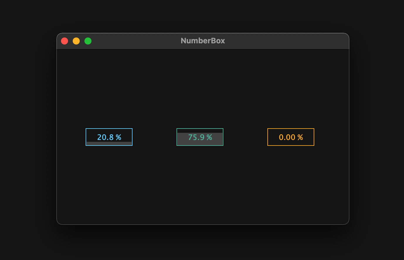
However, the value track color is in the way, so we change it to transparent by passing juce::Colours::tranparentWhite to setColour().
The rest of the member functions are explained in detail using GIFs in the following article, so I will skip them.
paint
Within this member function, we have implemented the lock-on mark to be drawn when Numberbox has the keyboard focus.
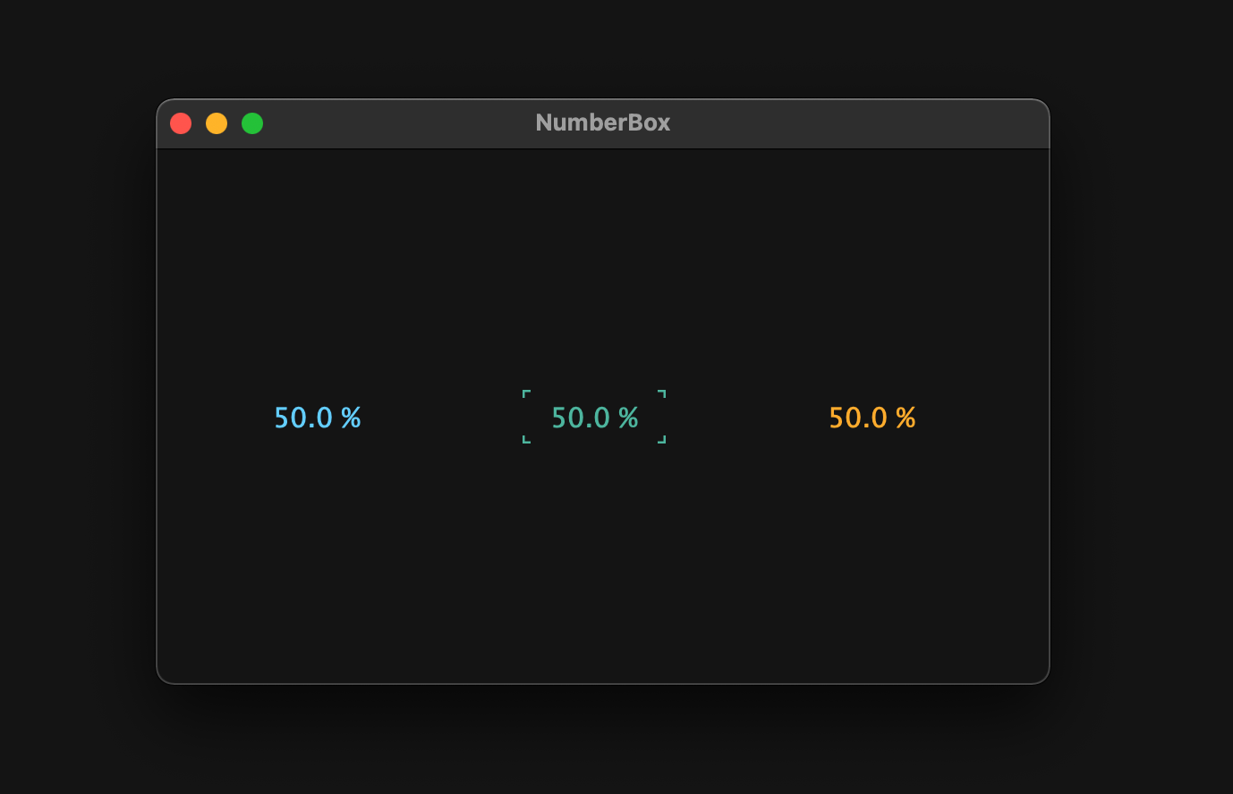 To determine if the NumberBox has the focus, use hasKeyboardFocus(). Then, in order for the component to have the focus, we need to add setWantsKeyboardFocus() and pass true to it, as implemented in the constructor above. But we have not implemented CustomLookAndFeel yet, so the lock-on mark will not be drawn yet.
mouseDown / mouseUp
In mouseDown(), we have implemented the mouse pointer to be hidden from the moment the mouse is clicked, because velocity mode does not hide the mouse pointer until we start dragging.
Then, by mouseUp(), the mouse pointer is displayed as it was and returns to the pointer position at the time of the mouse click.
MainComponent.h/.cpp
Okay, now that we have the basic functionality of the NumberBox implemented, let's add it to MainComponent.
Include NumberBox.h near the top in the MainComponent.h file:
#include "NumberBox.h"
Next, let's declare three-color NumberBox objects as shown below:
class MainComponent  : public juce::Component
{
public:
・・・
private:
    NumberBox blueBox, greenBox, yellowBox;

    juce::Colour blue   = juce::Colour::fromFloatRGBA (0.43f, 0.83f, 1.0f,  1.0f);
    juce::Colour green  = juce::Colour::fromFloatRGBA (0.34f, 0.74f, 0.66f, 1.0f);
    juce::Colour yellow = juce::Colour::fromFloatRGBA (1.0f,  0.71f, 0.2f,  1.0f);
    juce::Colour black  = juce::Colour::fromFloatRGBA (0.08f, 0.08f, 0.08f, 1.0f);

    JUCE_DECLARE_NON_COPYABLE_WITH_LEAK_DETECTOR (MainComponent)
};
Finally, edit MainComponent.cpp as shown below:
MainComponent::MainComponent()
{
    setSize (500, 300);
    setWantsKeyboardFocus (true);

    blueBox.setColour (juce::Slider::textBoxTextColourId, blue);
    blueBox.setColour (juce::Slider::textBoxOutlineColourId, blue);

    greenBox.setColour (juce::Slider::textBoxTextColourId, green);
    greenBox.setColour (juce::Slider::textBoxOutlineColourId, green);

    yellowBox.setColour (juce::Slider::textBoxTextColourId, yellow);
    yellowBox.setColour (juce::Slider::textBoxOutlineColourId, yellow);

    addAndMakeVisible (blueBox);
    addAndMakeVisible (greenBox);
    addAndMakeVisible (yellowBox);
}

MainComponent::~MainComponent()
{
}

void MainComponent::paint (juce::Graphics& g)
{
    g.fillAll (black);
}

void MainComponent::resized()
{
    auto bounds = getLocalBounds().withSizeKeepingCentre (80, 30);

    blueBox.setBounds (bounds.withX (50));
    greenBox.setBounds (bounds.withX (205));
    yellowBox.setBounds (bounds.withX (360));
}
Building
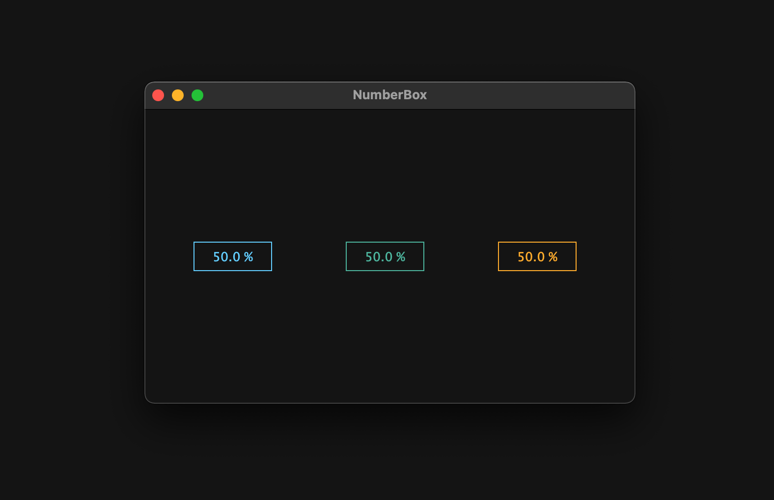
Now, we have finished the implementation of displaying NumberBox. Let's build and check it out!
CustomLookAndFeel
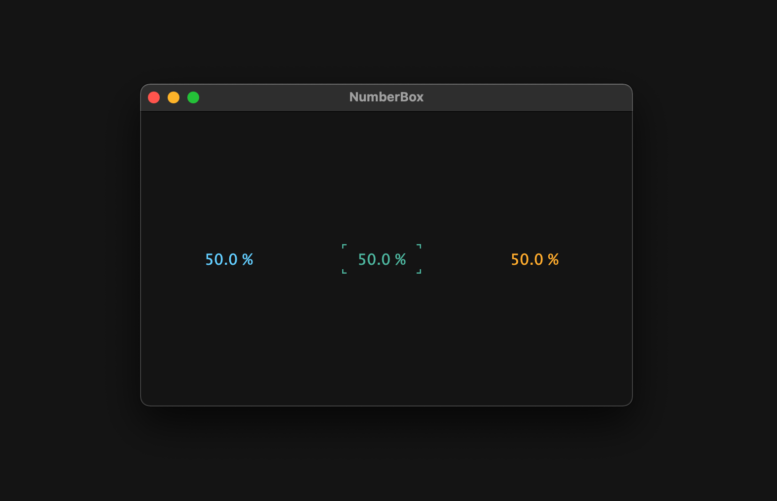
In this chapter, we will change the color of the caret and make sure that the lock-on symbol appears.
Customizing LookAndFeel
The member functions for setting the appearance of the caret and NumberBox are createCaretComponent() and createSliderTextBox(), respectively. Let's declare CustomLookAndFeel class at the top in the NumberBox.h file and override these functions.
class CustomLookAndFeel : public juce::LookAndFeel_V4
{
public:
    juce::CaretComponent* createCaretComponent (juce::Component* keyFocusOwner) override;
    juce::Label* createSliderTextBox (juce::Slider& slider) override;
};
Then, let's declare CustomLookAndFeel class object in NumberBox class.
class NumberBox  : public juce::Slider, public juce::KeyListener
{
public:
・・・
private:
    CustomLookAndFeel customLookAndFeel;
・・・
};
The definition part of the two overridden functions looks like the following:
juce::CaretComponent* CustomLookAndFeel::createCaretComponent (juce::Component* keyFocusOwner)
{
    auto caret = new juce::CaretComponent (keyFocusOwner);

    caret->setColour (juce::CaretComponent::caretColourId, keyFocusOwner->findColour (juce::Label::textColourId));

    return caret;
}

juce::Label* CustomLookAndFeel::createSliderTextBox (juce::Slider& slider)
{
    auto* l = new juce::Label();

    l->setJustificationType (juce::Justification::centred);
    l->setColour (juce::Label::textColourId, slider.findColour (juce::Slider::textBoxTextColourId));
    l->setColour (juce::Label::textWhenEditingColourId, slider.findColour (juce::Slider::textBoxTextColourId));
    l->setColour (juce::Label::outlineWhenEditingColourId, juce::Colours::transparentWhite);
    l->setFont (18);

    return l;
}
In createCaretComponent(), we set the color of the caret to the same color as the juce::Label::textColourId set in the component having Focus. This juce::Label::textColourId is set to the same color as the juce::Slider::textBoxTextColourId in createSliderTextBox(). Therefore, you can freely change the color of the caret from the NumberBox side.
Then, call setLookAndFeel() to apply CustomLookAndFeel to NumberBox.
NumberBox::NumberBox()
{
    setLookAndFeel (&customLookAndFeel);
・・・
}

NumberBox::~NumberBox()
{
    setLookAndFeel (nullptr);
}
Building
Okay, so let's build it and see!
Edit Mode
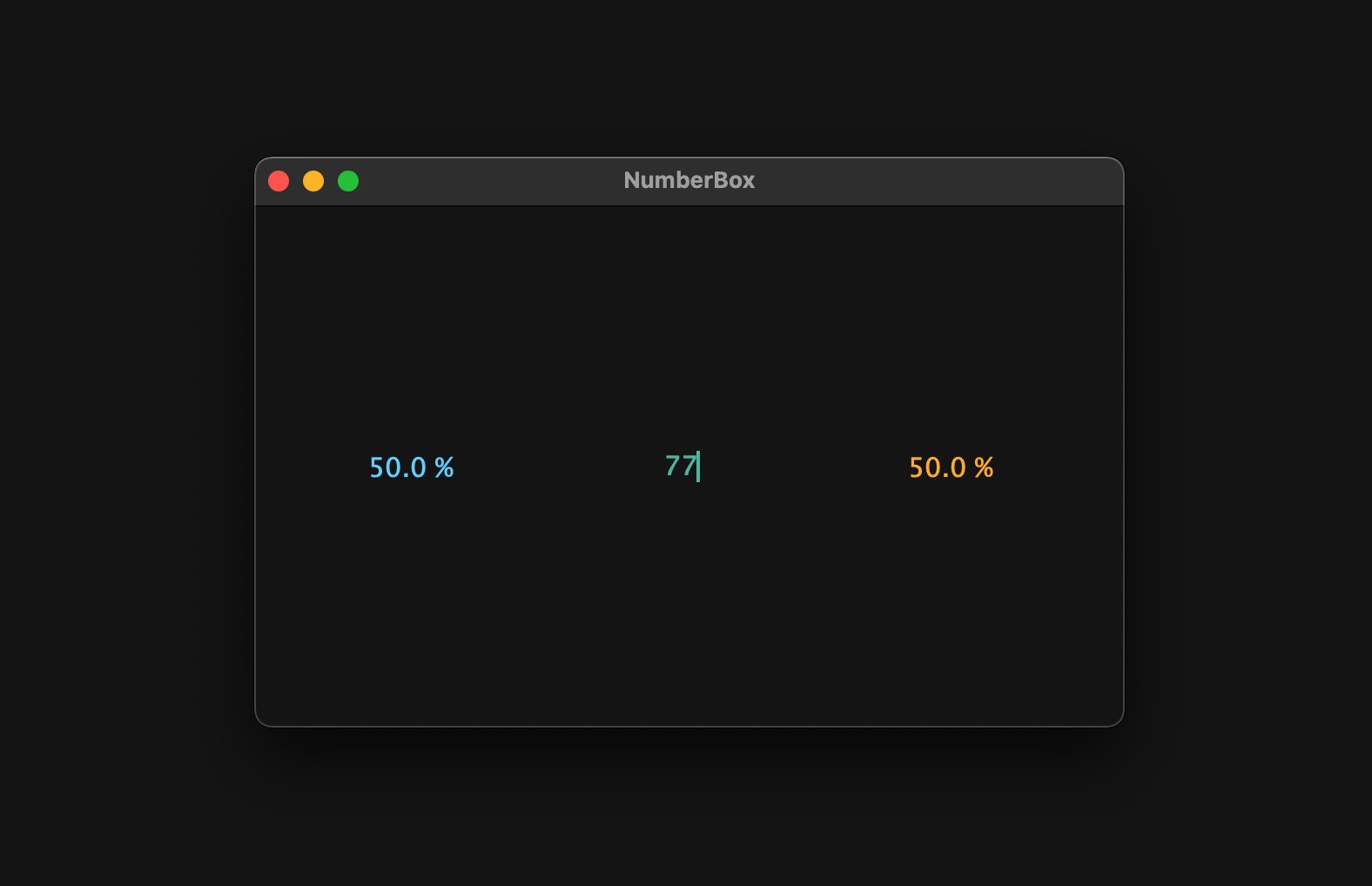
In this last section, we will add an extra feature, Edit Mode. This mode detects numeric keystrokes and updates to the entered value when the Enter key is pressed.
Customizing Label
As you can see from the return value of createSliderTextBox() that we just overrided, the appearance part of the NumberBox is created from juce::Label component. juce::Label will display juce::TextEditor when it becomes editable. Therefore, we need to change some TextEditor settings too.
Also, when juce::Label detects a key input and displays juce::TextEditor, the first key input is recognized as a trigger to display TextEditor, and its value is not input, but can be input from the next key. Hence, it is also necessary to implement it so that the value is input from the first key pressed.
Based on the above, Numberbox.h/.cpp will look like the following.
NumberBox.h:
class CustomLabel : public juce::Label
{
public:
    static juce::String initialPressedKey;

    juce::TextEditor* createEditorComponent() override;
    void editorShown (juce::TextEditor* editor) override;
};
class CustomLookAndFeel : public juce::LookAndFeel_V4
{
public:
・・・
    CustomLabel* createSliderTextBox (juce::Slider& slider) override;
};
NumberBox.cpp:
juce::String CustomLabel::initialPressedKey = "";

juce::TextEditor* CustomLabel::createEditorComponent()
{
    auto* ed = juce::Label::createEditorComponent();

    ed->setJustification (juce::Justification::centred);
    ed->setColour (juce::TextEditor::backgroundColourId, juce::Colours::transparentWhite);
    ed->setInputRestrictions (5, "0123456789.");
    ed->setIndents (4, -1);

    return ed;
}

void CustomLabel::editorShown (juce::TextEditor* editor)
{
    editor->clear();
    editor->setText (initialPressedKey);
}
CustomLabel* CustomLookAndFeel::createSliderTextBox (juce::Slider& slider)
{
    auto* l = new CustomLabel();
・・・
}
The important point is that the return value of createSliderTextBox is changed from juce::Label to CustomLabel. By doing this, the customized label is now used to draw NumberBox.
Then, the variable introduced here, initialPressedKey, will take effect through its implementation in keyPressed(), which will be implemented later.
Overriding keyPressed
Let's override keyPressed(), a member function of the component class that is called when the component has gained keyboard focus and a key is pressed.
class NumberBox  : public juce::Slider
{
public:
・・・
    bool keyPressed (const juce::KeyPress& k) override;
bool NumberBox::keyPressed (const juce::KeyPress& k)
{
    char numChars[] = "0123456789";

    for (auto numChar : numChars)
    {
        if (k.getTextCharacter() == numChar)
        {
            setTextBoxIsEditable (true);
            CustomLabel::initialPressedKey = juce::String::charToString (numChar);
            showTextBox();
            setTextBoxIsEditable (false);

            return true;
        }
    }

    return false;
}
Only numeric key input is allowed, and the first key pressed is passed to the static variable initialPressedKey. It is also important to note that setTextBoxIsEditable() is temporarily set to true, and if it is not set back to false immediately, dragging on NumberBox will not be possible.
Also, in order to allow NumberBox to gain keyboard focus, pass true to the setWantsKeyboardFocus function, in this case we have already set this function:
NumberBox::NumberBox()
{
・・・
    setWantsKeyboardFocus (true);
}
Building
That's it, all implemented! Let's build it and see.
Conclusion
In this tutorial, I explained how to implement NumberBox and how to customize its appearance. An example of adding this NumberBox to the GUI of an actual audio plug-in is shown below.
Finally, if there is a more efficient way to implement NumberBox, please let me know via DM. Thank you for reading to the end!
